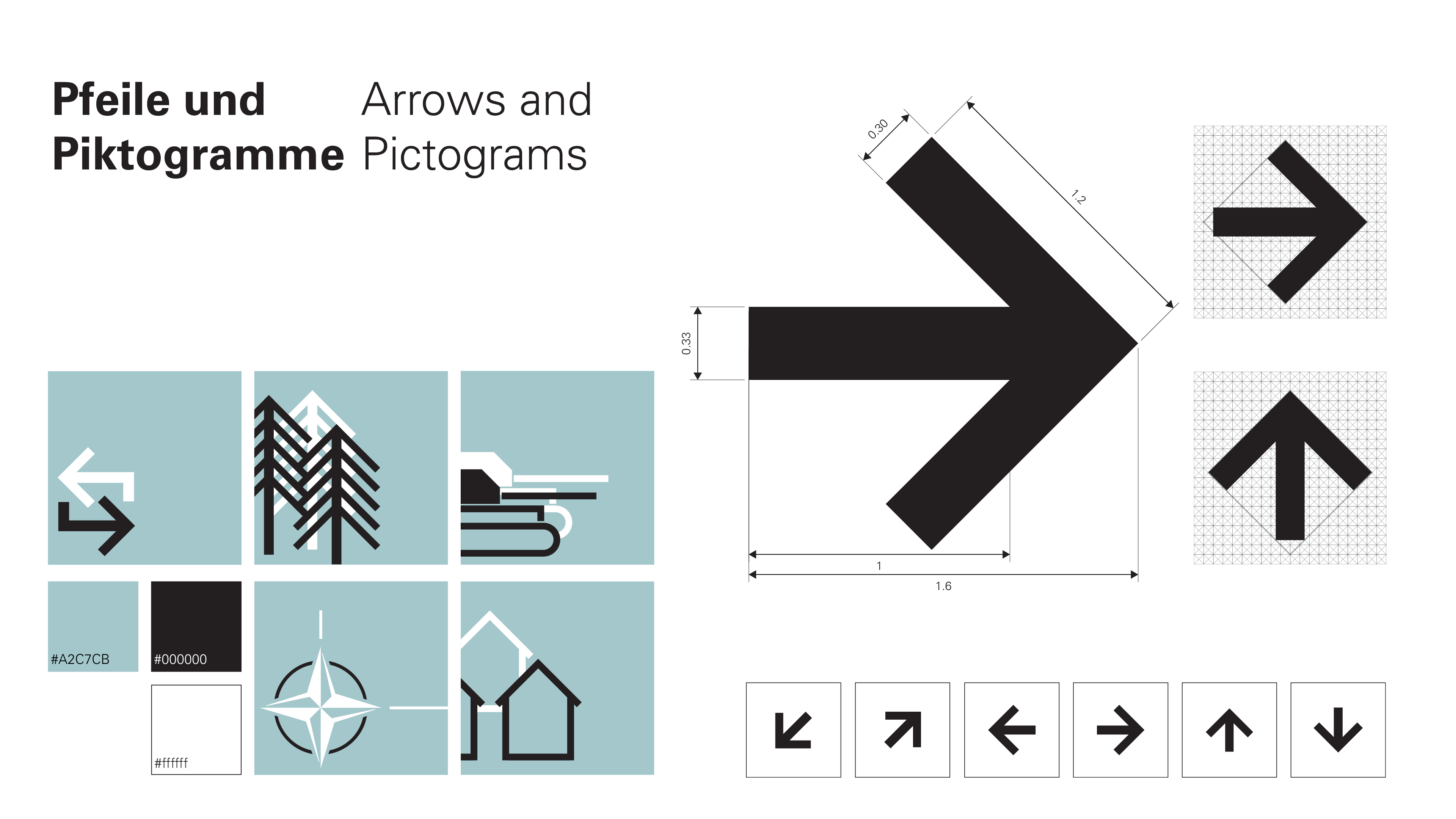
Information Design
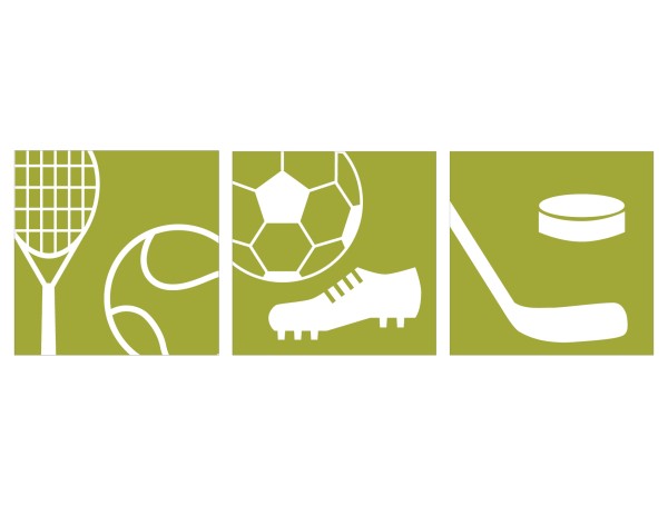
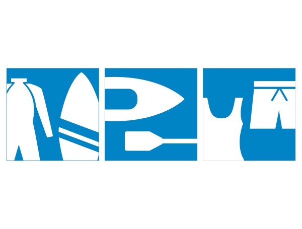
Pictograms for sports retail shop
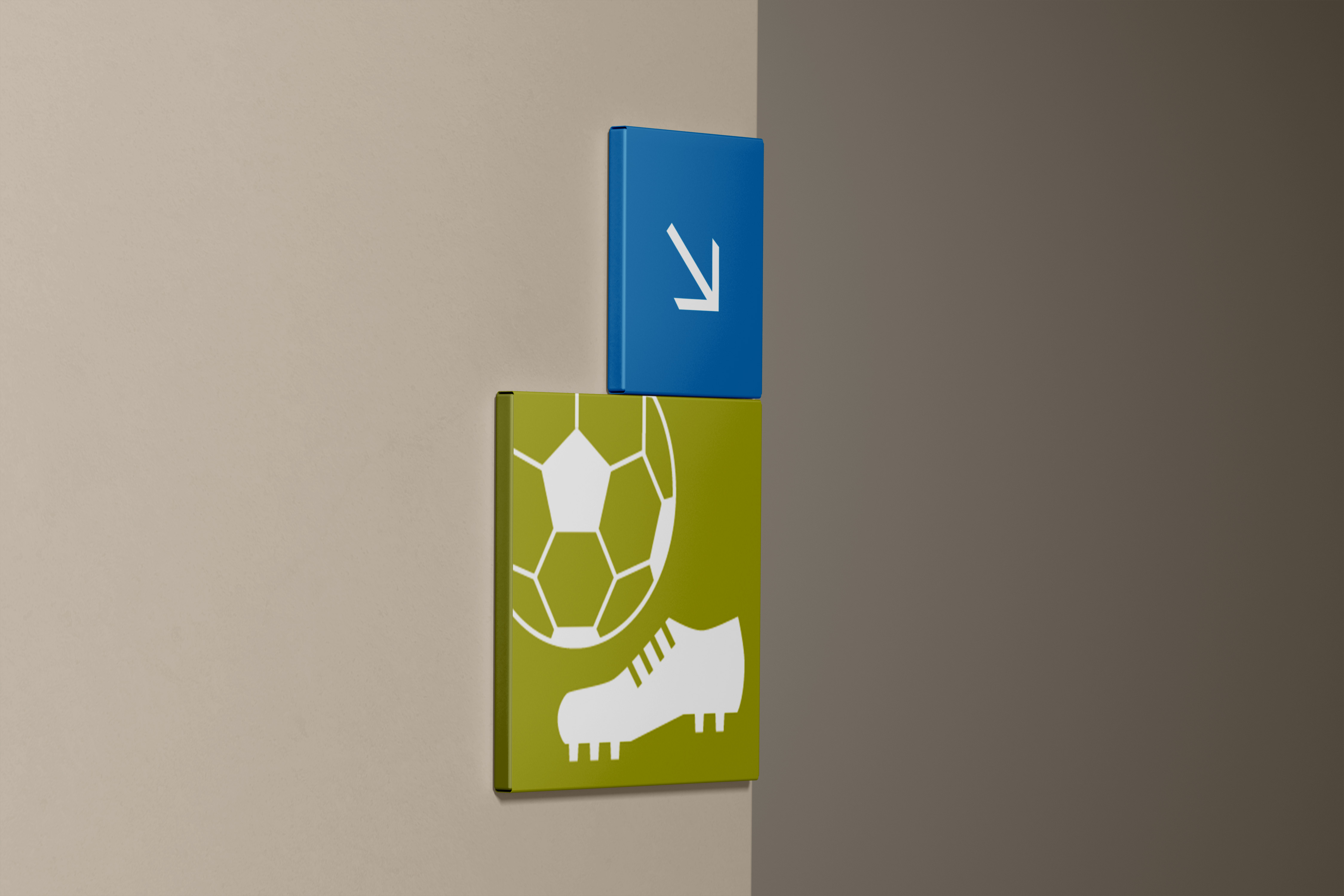
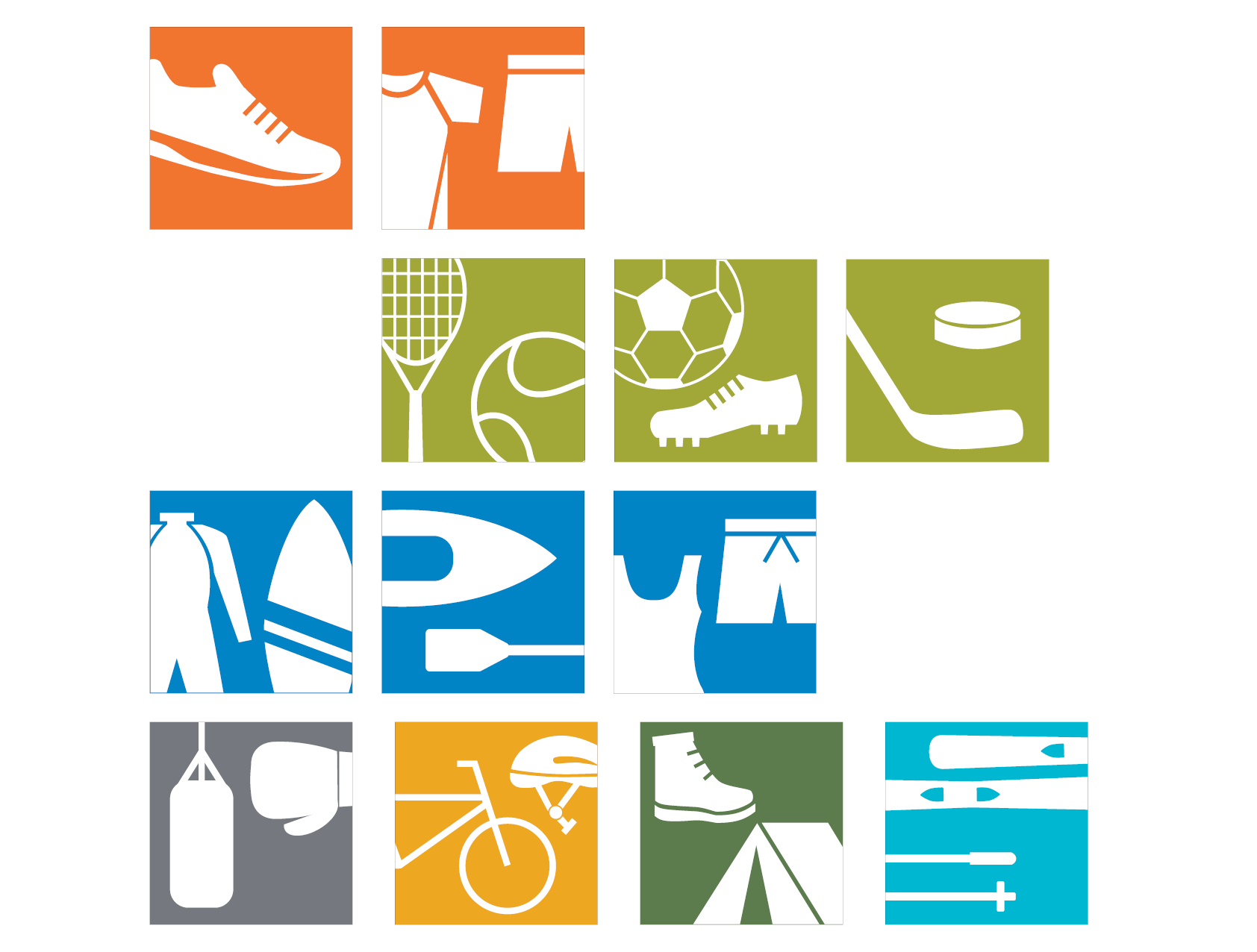
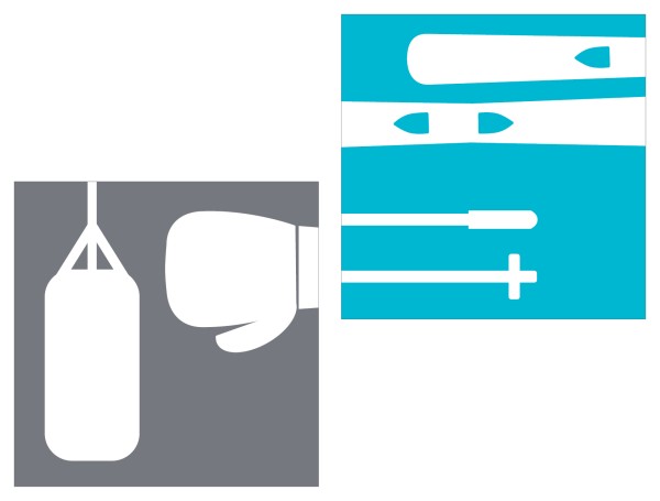
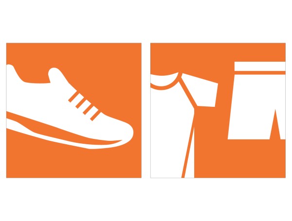
These pictogram series were designed for Decathlon, an international sporting goods manufacturer and retailer.
Decathlon‘s branding is rooted in simplicity, functionality, and accessibility, aligning with its mission to make sports accessible to all. Their branding style is modern minimalist with a focus on utility and clarity.
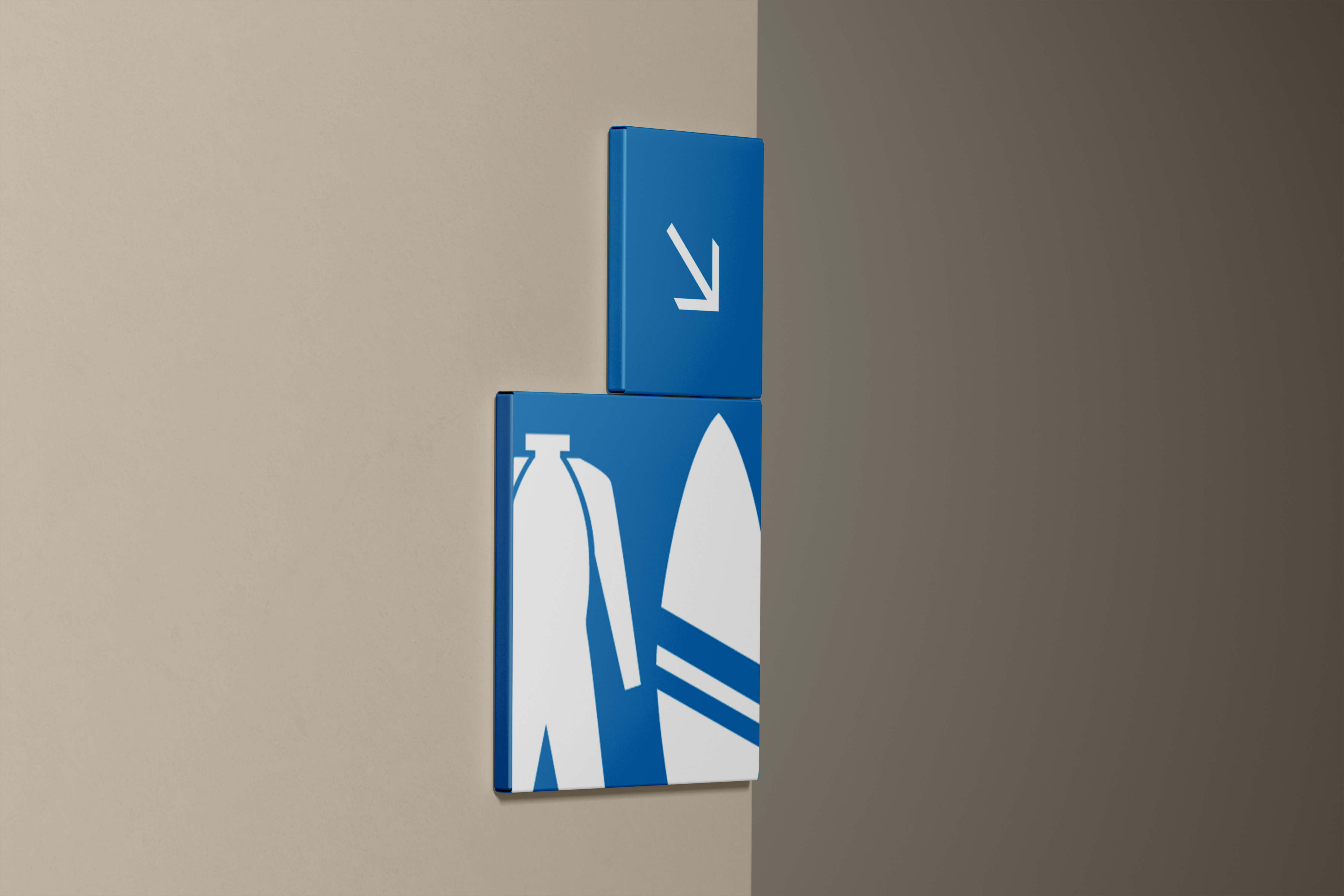
The pictogram designs for Decathlon follow a similar theme: white icons mounted on a coloured background. The colours represent specific categories found within store. The white stands and follows Decathlon‘s brand identity and logo: white type on a blue background.
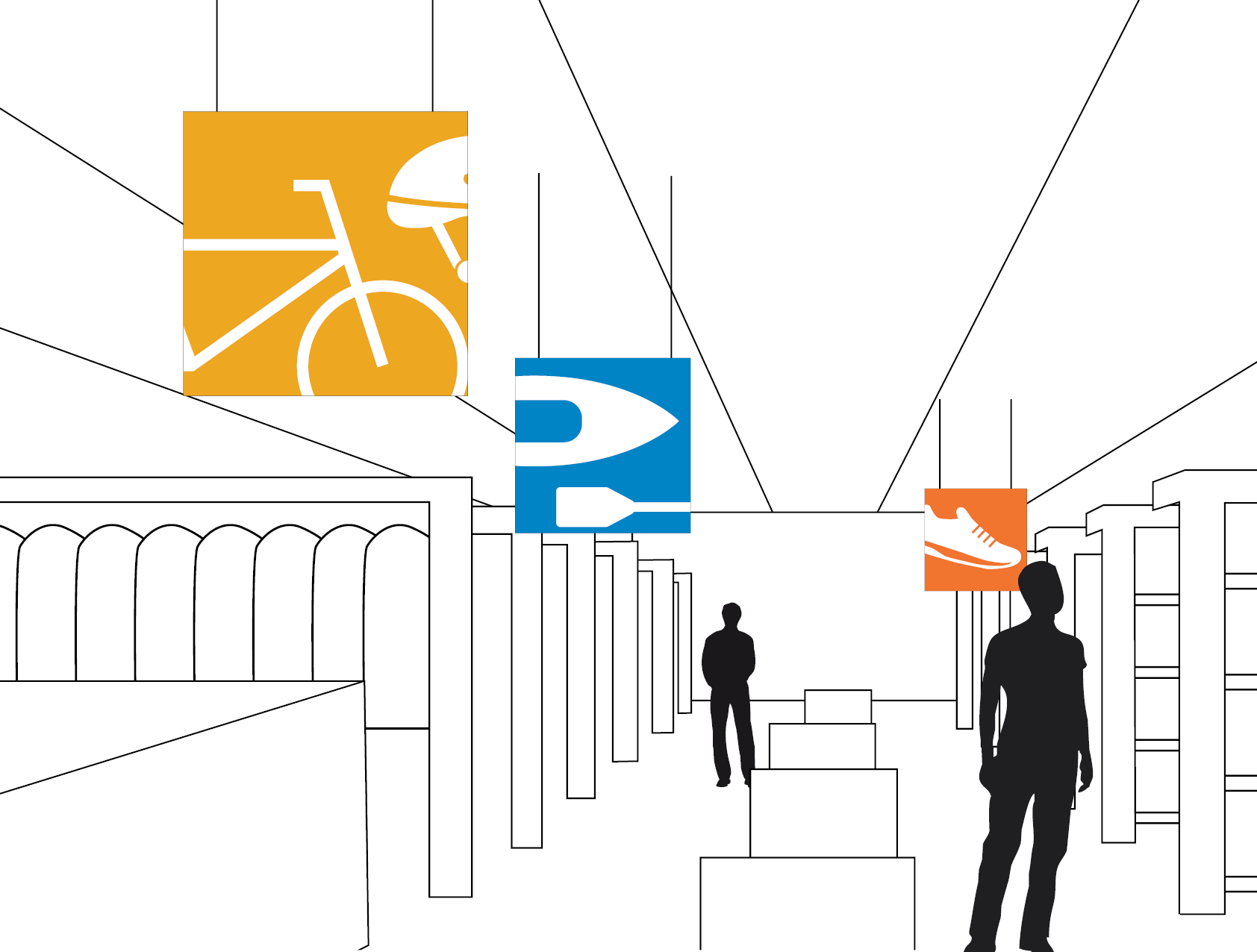
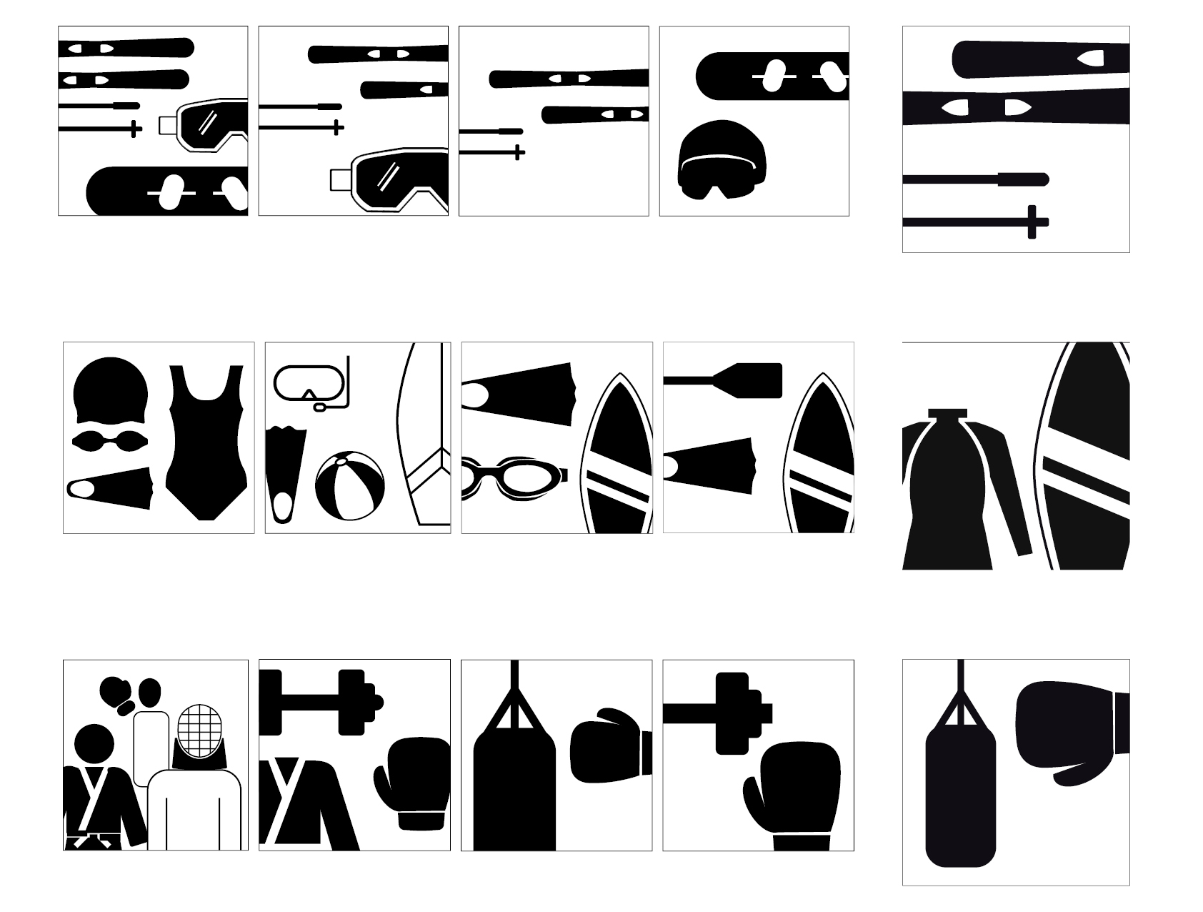
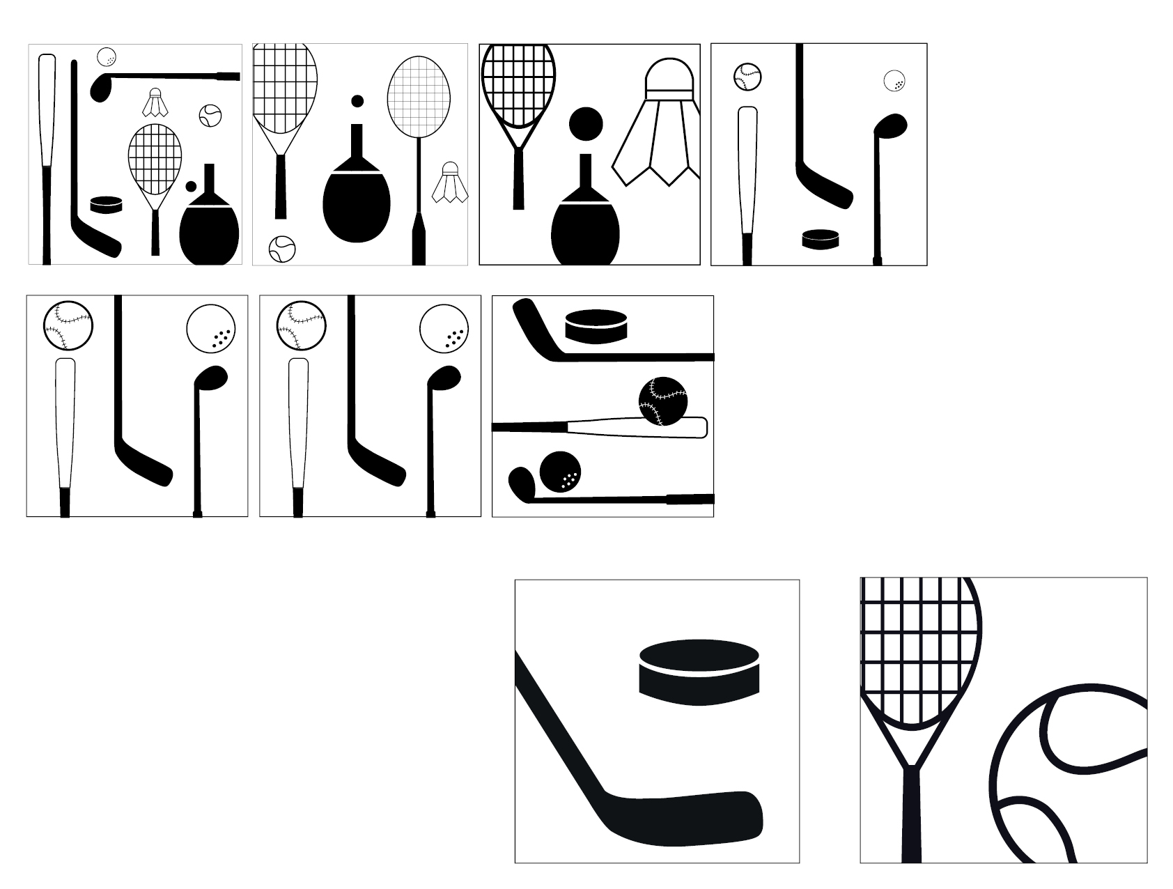
Shown here is the development of some of the pictogram series. I made lots of adjustments and style choices. A simpler layout was chosen in the end. They pictograms are more legible and coherent this way.