Leitsysteme
Orientation Systems – Limes Trail reimagined
The objective of this semester project was to redesign the way-finding system of the Limes Trail.
The task offered complete creative freedom, allowing us to rethink the existing signage and visitor guidance without predefined design constraints.
Concept & Research
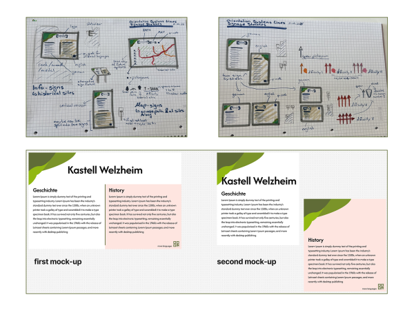
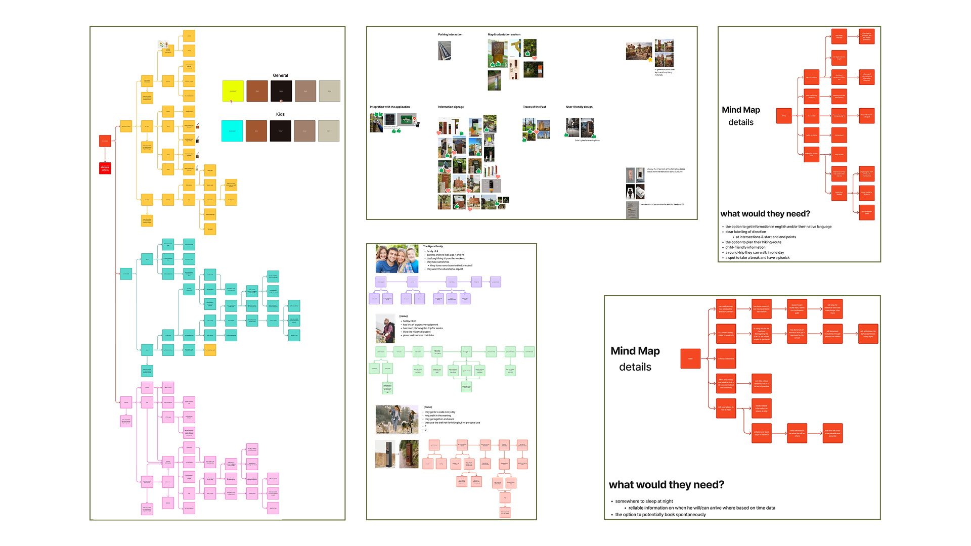
The development of our wayfinding system was an iterative research process that combined user analysis, visual exploration, and continuous testing. We created multiple mind maps for different user groups, including families, hikers, cyclists, and international visitors, to better understand their individual needs and expectations. These insights formed the foundation of our concept and helped us define the structure and functions of the system.
Our goal was to develop a coherent, modern, and future oriented way-finding concept that not only improves orientation but also enhances the overall visitor experience. Rather than creating a solution limited to a single location, we designed a modular system that can be implemented along the entire Limes and adapted to different regions while maintaining a consistent visual identity.
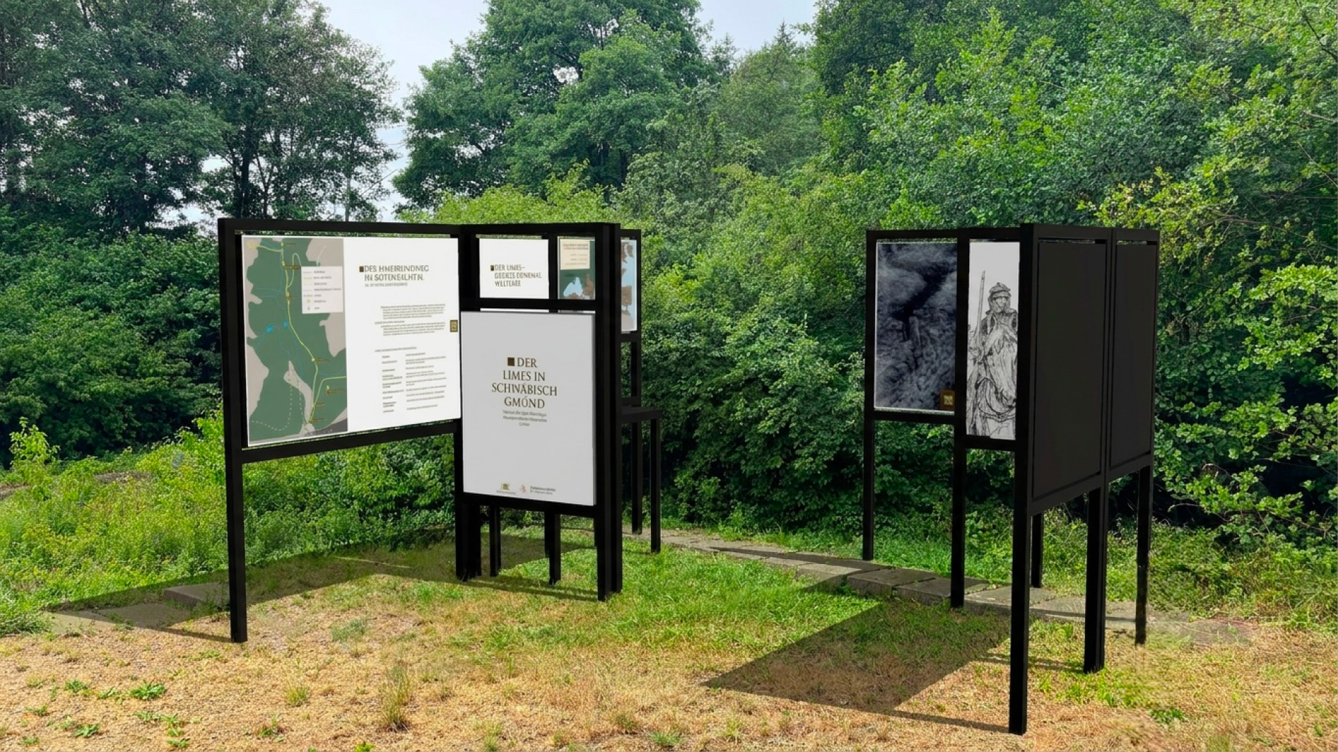
The concept combines clear navigation, historical interpretation, accessibility, and digital interaction. It includes orientation signs, information panels, parking guidance, family friendly elements, resting areas, and digital touch-points that allow visitors to experience the history of the Roman frontier in an engaging and contemporary way.
Typography, Colour Palette & Icon System
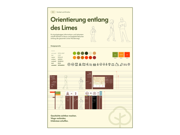
For the entire wayfinding system, we chose Afacad Flux as the sole typeface for headings, body text, pictograms, and the logo. Using a single font family throughout creates a consistent visual identity and strengthens the recognizability of the design across all applications.
The colour palette was developed to reflect both the natural landscape of the Limes and the historical significance of the Roman frontier. Rather than relying on highly saturated colours, we selected a range of earthy and muted tones that blend harmoniously into forests, meadows, and archaeological sites while remaining clearly visible for visitors. The palette is divided into several colour groups that provide a flexible yet consistent design system.
A consistent icon system is essential for creating an intuitive and universally understandable wayfinding experience. Our goal was to develop a visual language that allows visitors to recognize information quickly, regardless of language or prior knowledge. The Icons in black were sourced from Phosphor Icons, the ones in red were modified and the ones in green were designed by us in the same style. Additionally, we modified them to fit our map index.

Logo
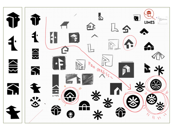
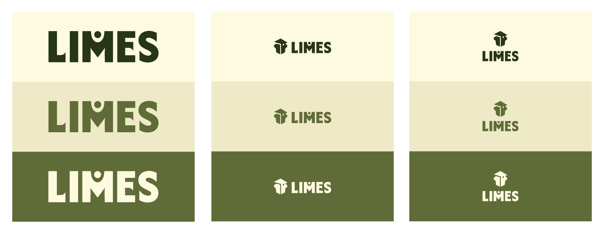
The logo was designed to create a recognizable identity that reflects both the historical significance of the Limes and the modern character of the new wayfinding system. Instead of developing a completely new typeface, we used Afacad Fluxas the foundation and carefully customized individual letterforms to create a distinctive and memorable wordmark.
Map
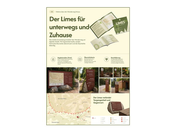
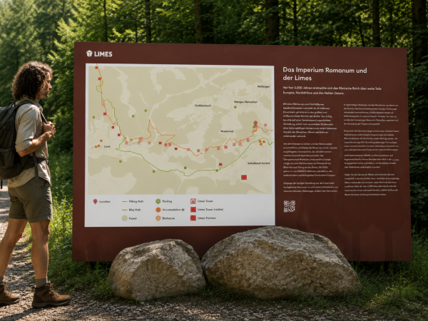
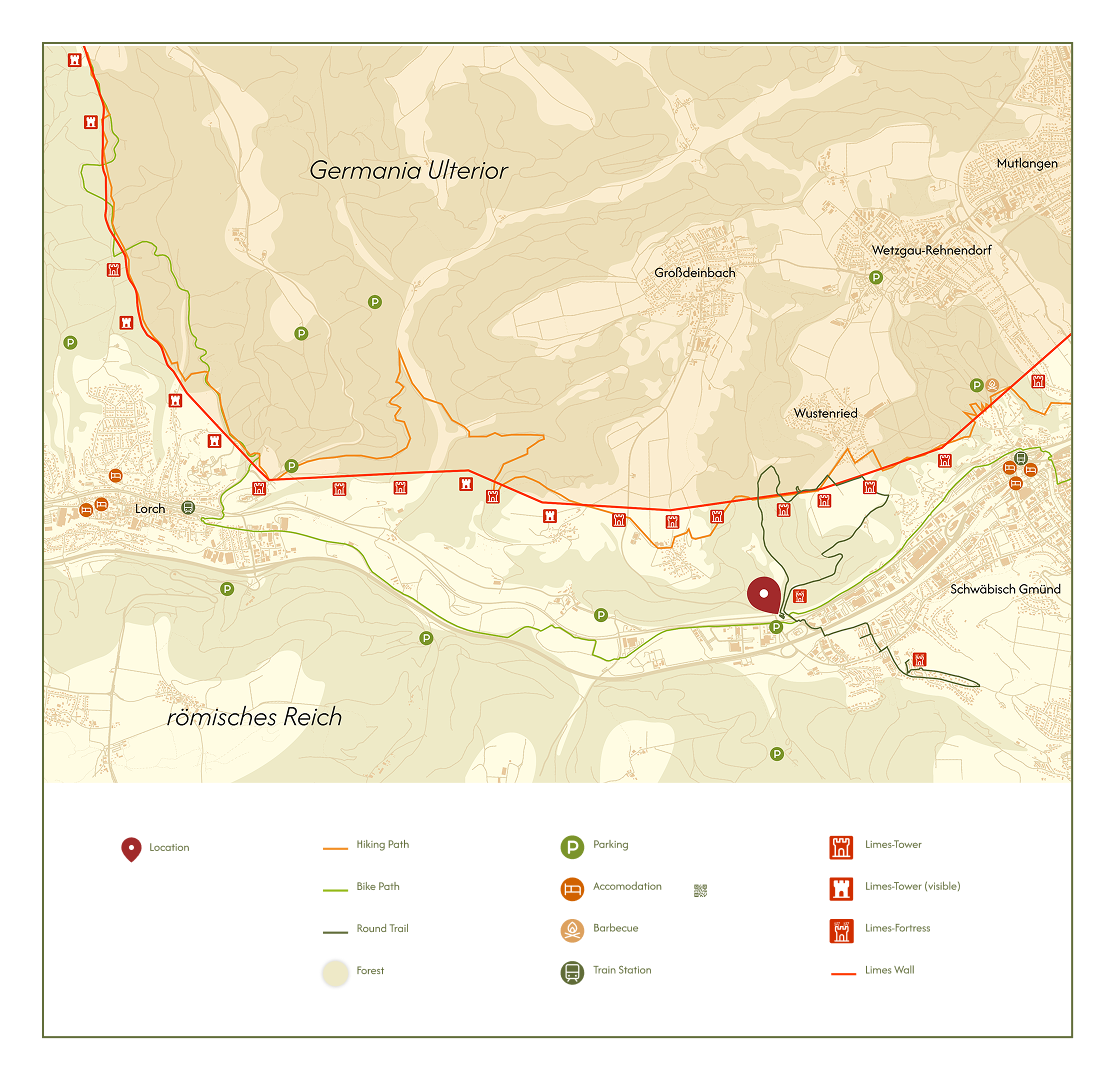
The map was designed to provide visitors with a clear overview of the Limes trail while remaining easy to read in both print and digital formats. Our focus is the Schwäbisch Gmünd section of the Limes, presenting all relevant information without overwhelming the user.
Signage System
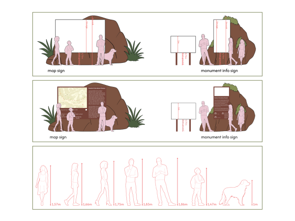
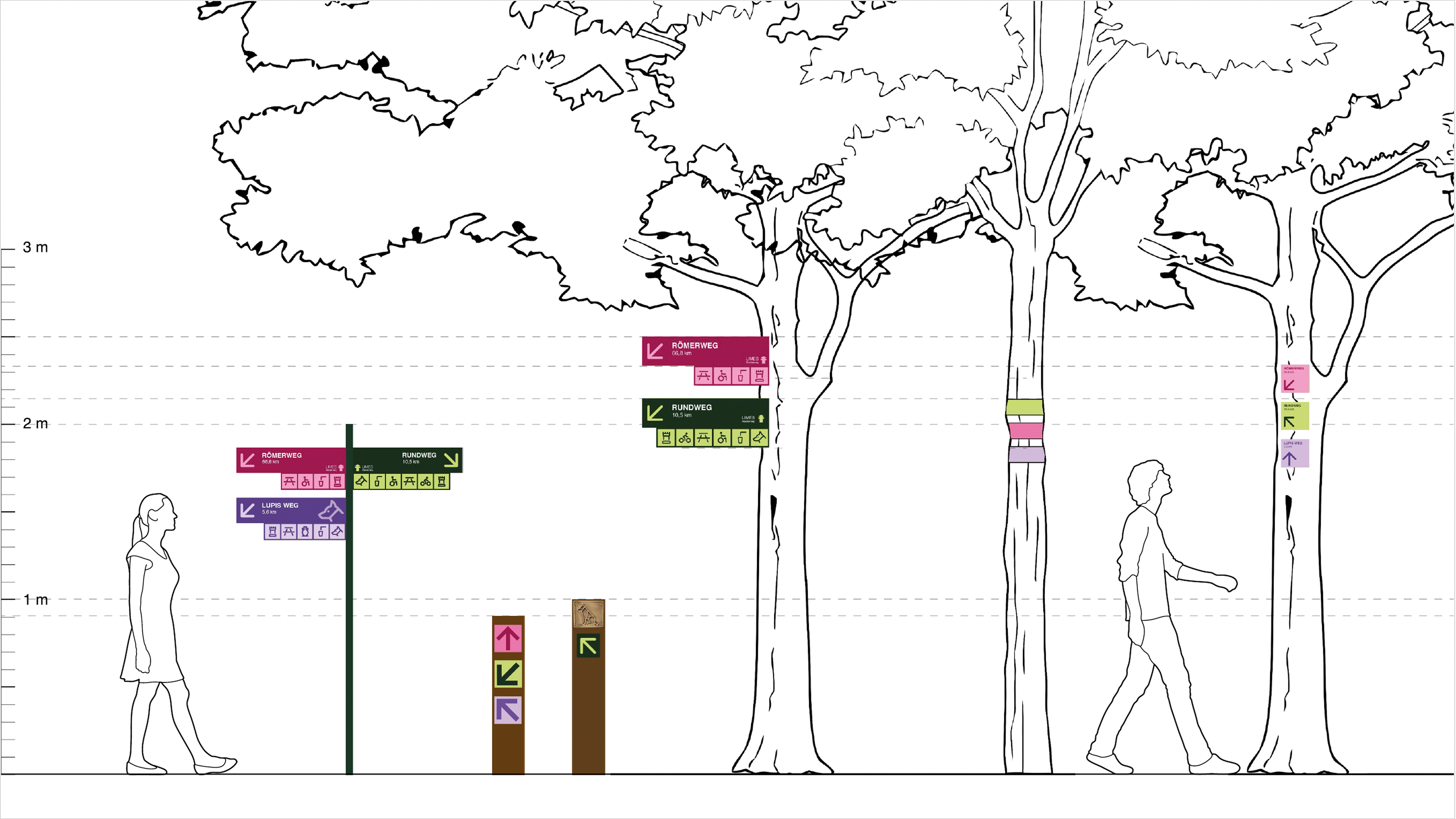
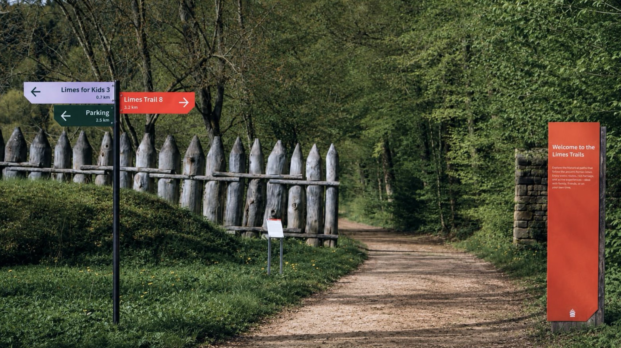
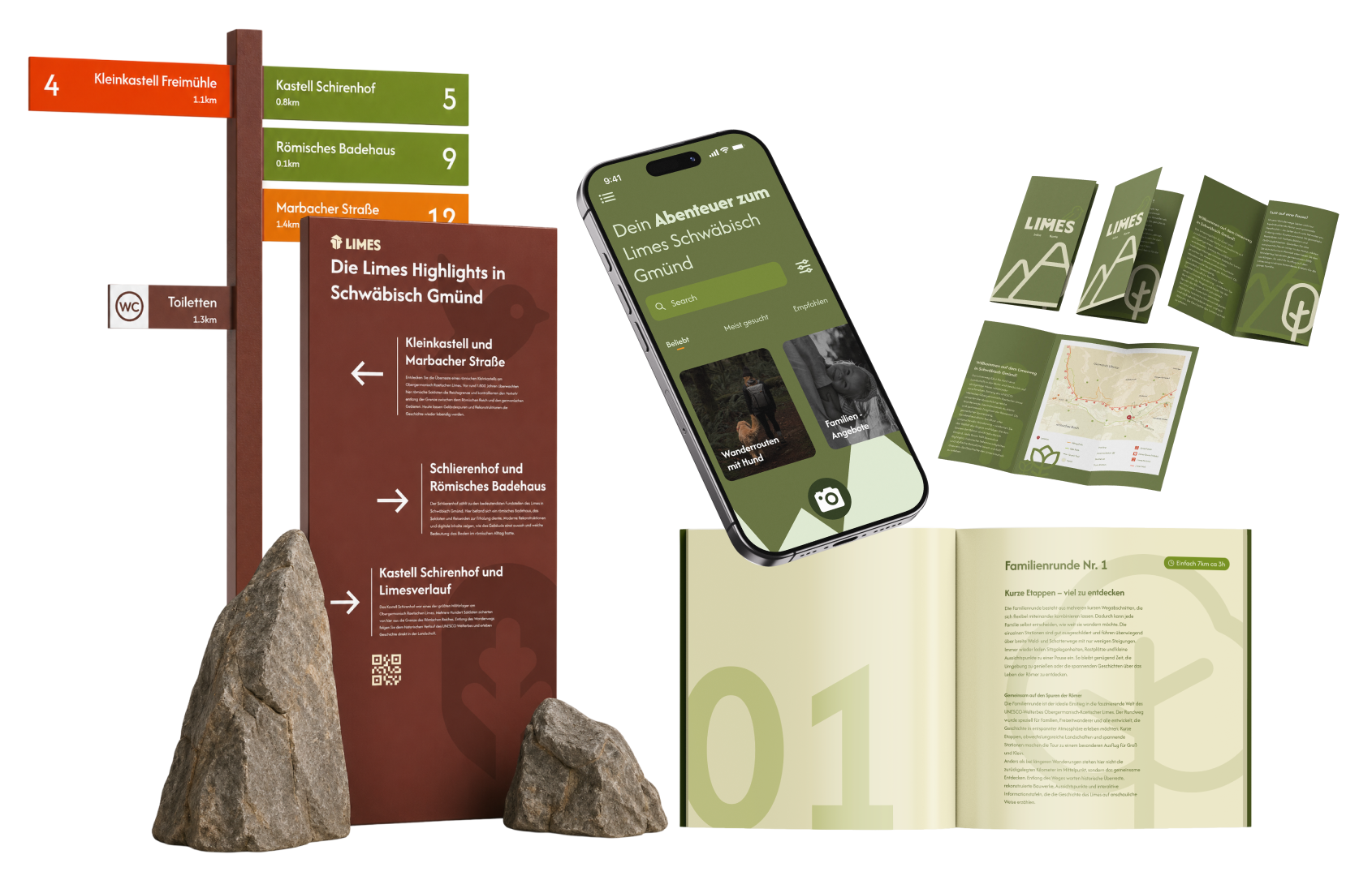
The signage system was developed as a modular family that provides consistent orientation throughout the entire Limes trail. Every sign follows the same visual language, allowing visitors to immediately recognize information regardless of their location.
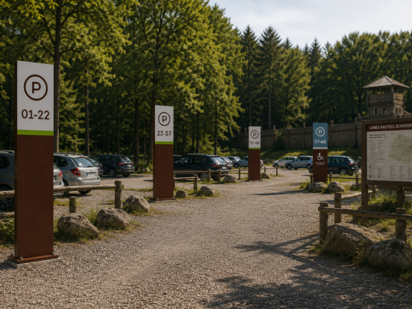
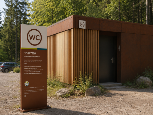
The system includes large information panels, orientation maps, directional signs, parking and facility signs, route markers, kilometre posts, and small trail markers. Each element is adapted to its specific function while maintaining a unified appearance through consistent typography, colours, materials, and iconography.
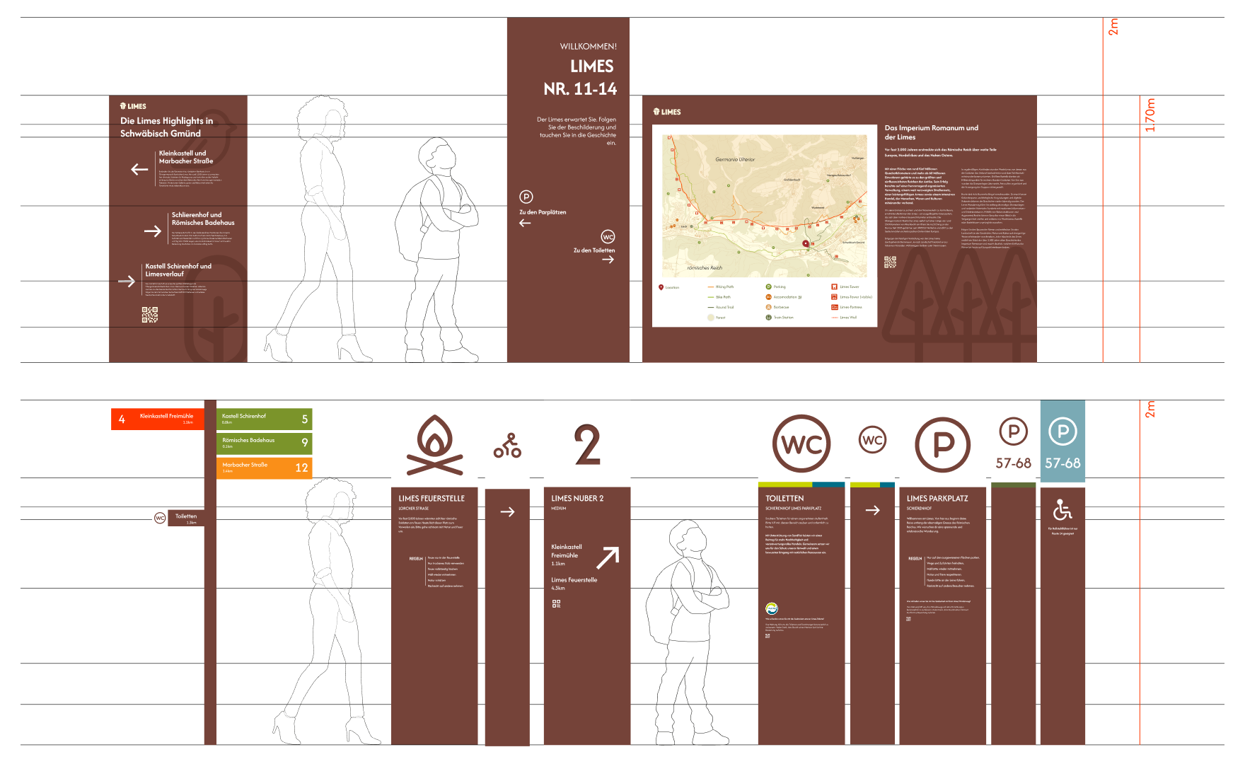
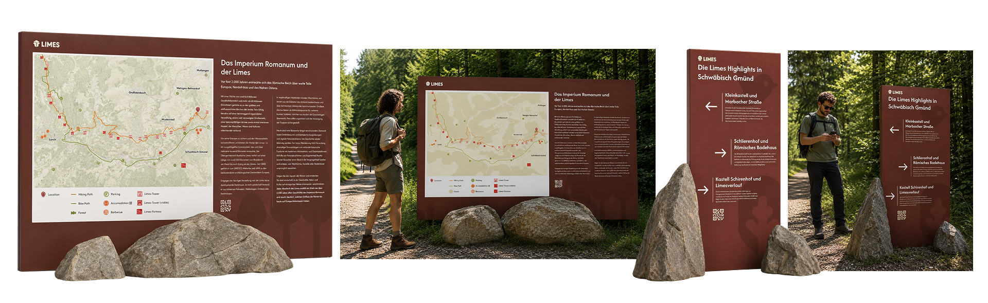
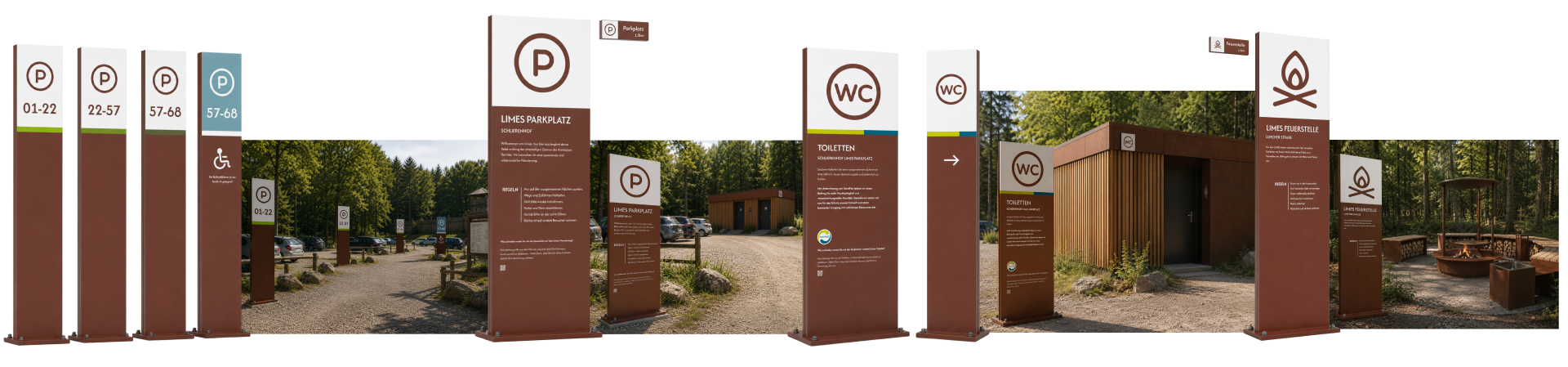
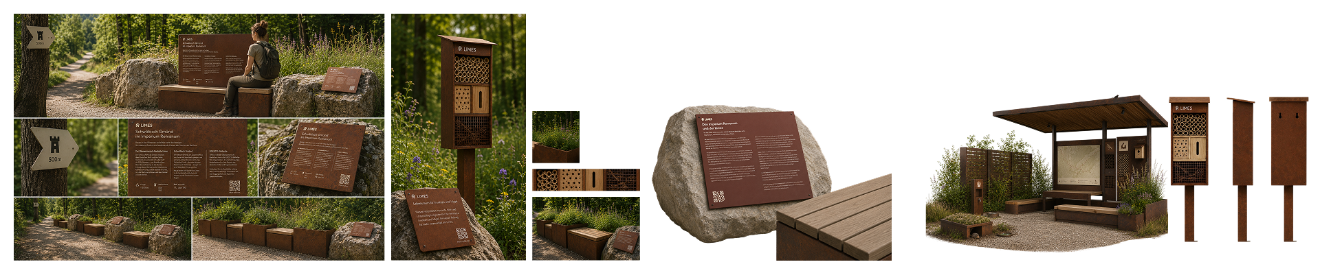
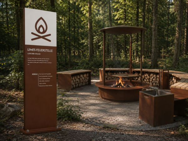
A clear hierarchy helps users quickly distinguish between information, navigation, and services. Large panels provide historical background and maps, while smaller signs guide visitors efficiently along the trail. Parking, toilets, viewpoints, fire pits, cycling routes, and accessible paths are identified through standardized pictograms for intuitive wayfinding.
The modular approach allows the system to be expanded or adapted to different sites without redesigning individual elements. Whether at a major archaeological site, a forest junction, or a small hiking trail, every sign contributes to a coherent identity that can be implemented consistently along the entire UNESCO Limes route.
Flyer, Booklet & App
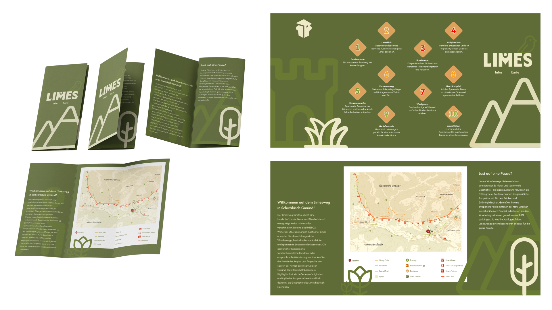
The flyer was developed as a complementary companion to the signage system, offering visitors a compact and portable introduction to the Limes Trail before and during their visit. It translates the same visual language established across the signage family, using consistent typography, colours, and iconography so that the printed material feels immediately connected to what visitors encounter on site.
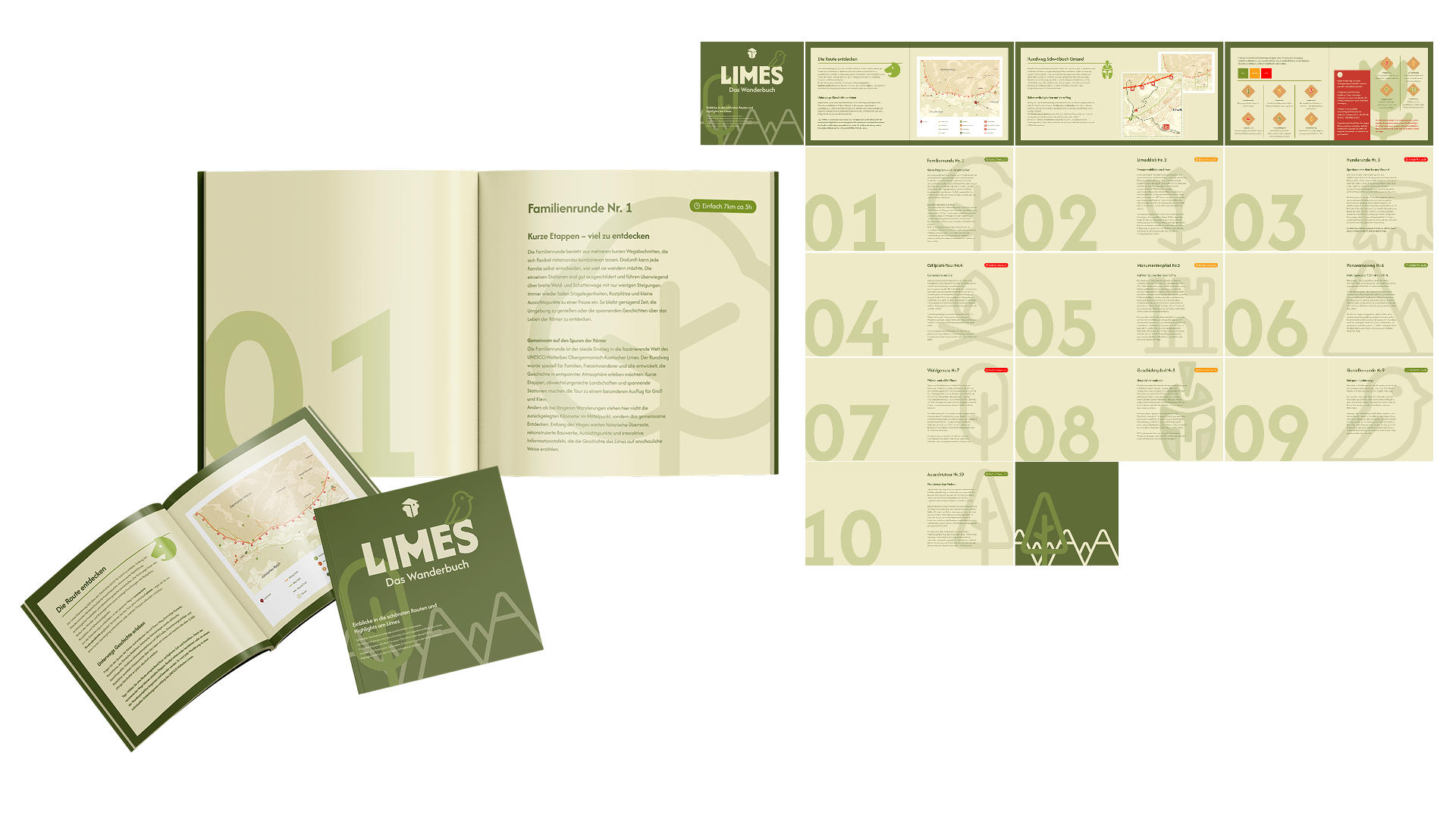
For visitors who wish to inform themselves at home before setting out on their hike, the booklet was developed as a more comprehensive extension of the way-finding system. It translates the same visual language established across the signage family, using consistent typography, colours, and iconography so that the printed material feels immediately connected to what visitors encounter on site.
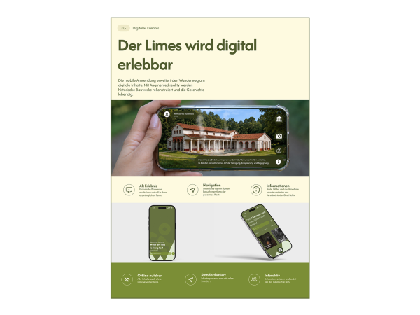
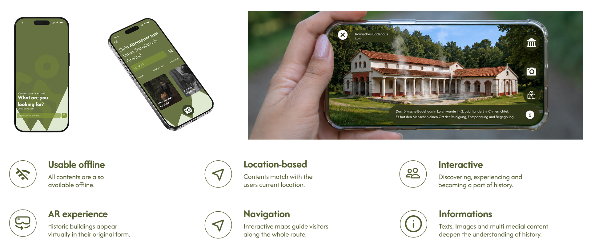
To complement the physical way-finding system, the app was developed as a digital companion that combines route planning, site information, and navigation in a single tool. Drawing on the same typography, colours, and iconography developed for the signage family, the app carries the visual identity of the trail into the digital space, creating a seamless connection between the physical and digital visitor experience.
Summary
Looking back on this semester project, the redesign of the Limes Trail way-finding system was a complex yet rewarding challenge. Early on, we realized that a single-site solution could not represent the vast scale of this UNESCO World Heritage Site. This led us to develop a flexible, modular system capable of adapting to diverse regions while maintaining a consistent, recognizable identity.
To establish this identity, we built
a coherent visual language—comprising typography, colors, icons, and materials—across all visitor touchpoints. This language formed the core of our physical signage system, which sets a clear hierarchy between information, navigation, and services.
We then extended this identity into printed media (the flyer and booklet) for portable, varying depths of information, and into the digital realm via an app that features reliable offline navigation and engaging augmented reality (AR) learning tools.
The central challenge was balancing consistency with adaptability across multiple scales, from large info panels to small trail markers and interactive apps. Ultimately, this project proves that thoughtful design does more than guide people; it communicates cultural heritage, improves accessibility, and respects historical depth through contemporary tools. We believe this modular approach offers a future-oriented foundation worthy of the Limes Trail.
used programs: Figma, Adobe Illustrator, Adobe InDesign, Adobe Photoshop, ProCreate, claude AI, ChatGPT, NanoBanana (Gemini) AI
Jiwoong Choo, Hyeyeong Hyun, Josephine Grafe, Marla Winter
BetreuungLena Heim, Prof. Marc Guntow
Tags