Web Design
shelter.me – One website for all animal shelters
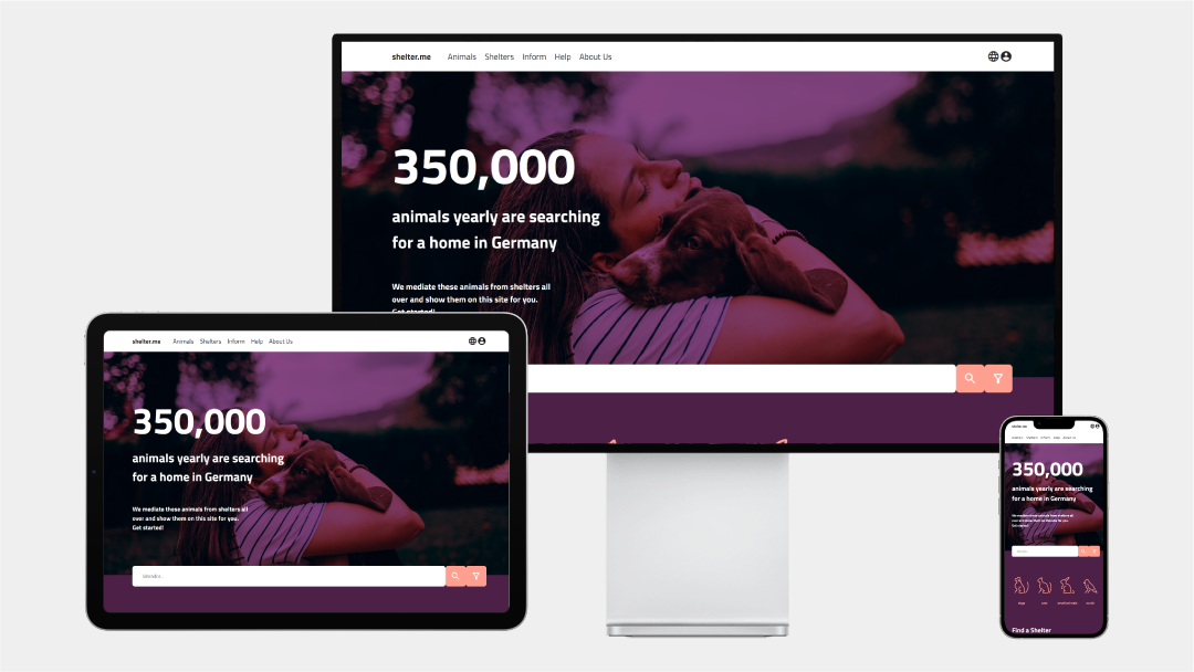
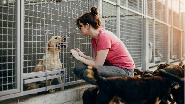
A website that brings together all animal shelters in one place on the web. So that the annoying search for a website, if any, or even just a Facebook page for an animal shelter in your area comes to an end.
Animal shelters do a great job of housing and adopting animals. They depend on donations, volunteers and their website, which is mostly old, no longer up-to-date and simply poorly made. The solution is a website where animal shelters can convey animals for free. They only have to upload pictures and information of the animals and shelter.me takes care of the rest. So, as a user who wants to help an animal, you have a larger choice and don’t have to bother with bad websites or even just a Facebook page.
For the design we wanted a fresh, but still professional and serious look. A lot of our image material has green and earth toned colors, so we decided to go with a contrasting purple and pink for our main colors. Also deciding on purple overlays on the images we wanted to set further in the background. Icons, with a clear but open design help to communicate the information faster. The font, is legible and adds enough character to be distinct, but doesn’t pull the attention away from the content.
During our process we focused most of our attention on the way the animals and other content is presented to the viewer. We created a clear navigation structure and multiple ways to reach the content wanted by the user. Main components are small preview windows, which rely on primarily visual content. More detailed information is provided via pop-ups.