Leitsysteme
Leitsystem Busbahnhof Schwäbisch Gmünd
1. Concept, Sizing, Scale, 2D View
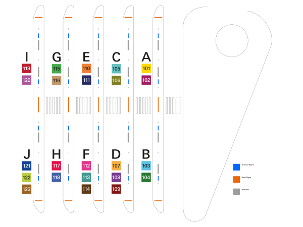
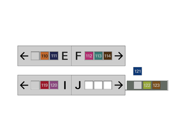
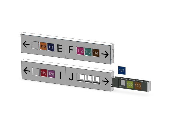
We have reorganized the bus routes and assigned them to a new 100-number system. All routes traveling in the same direction stop at one bus platform. The previous bus platforms (1B-1D, 2A-2D, (…), 6A-6D) have been reassigned to a new concept. We now have a total of only 10 bus platforms, labeled from A to J. A maximum of 3 bus lines depart from each stop, with colors that are easily distinguishable from one another to provide sufficient contrast.
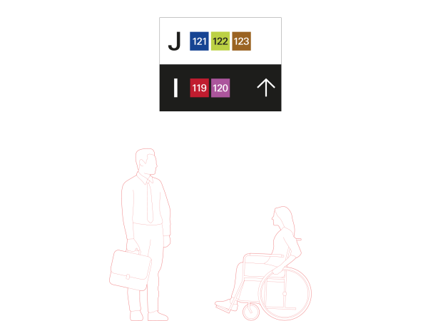
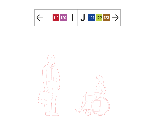
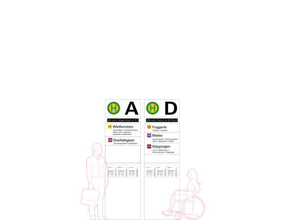
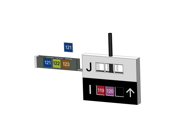
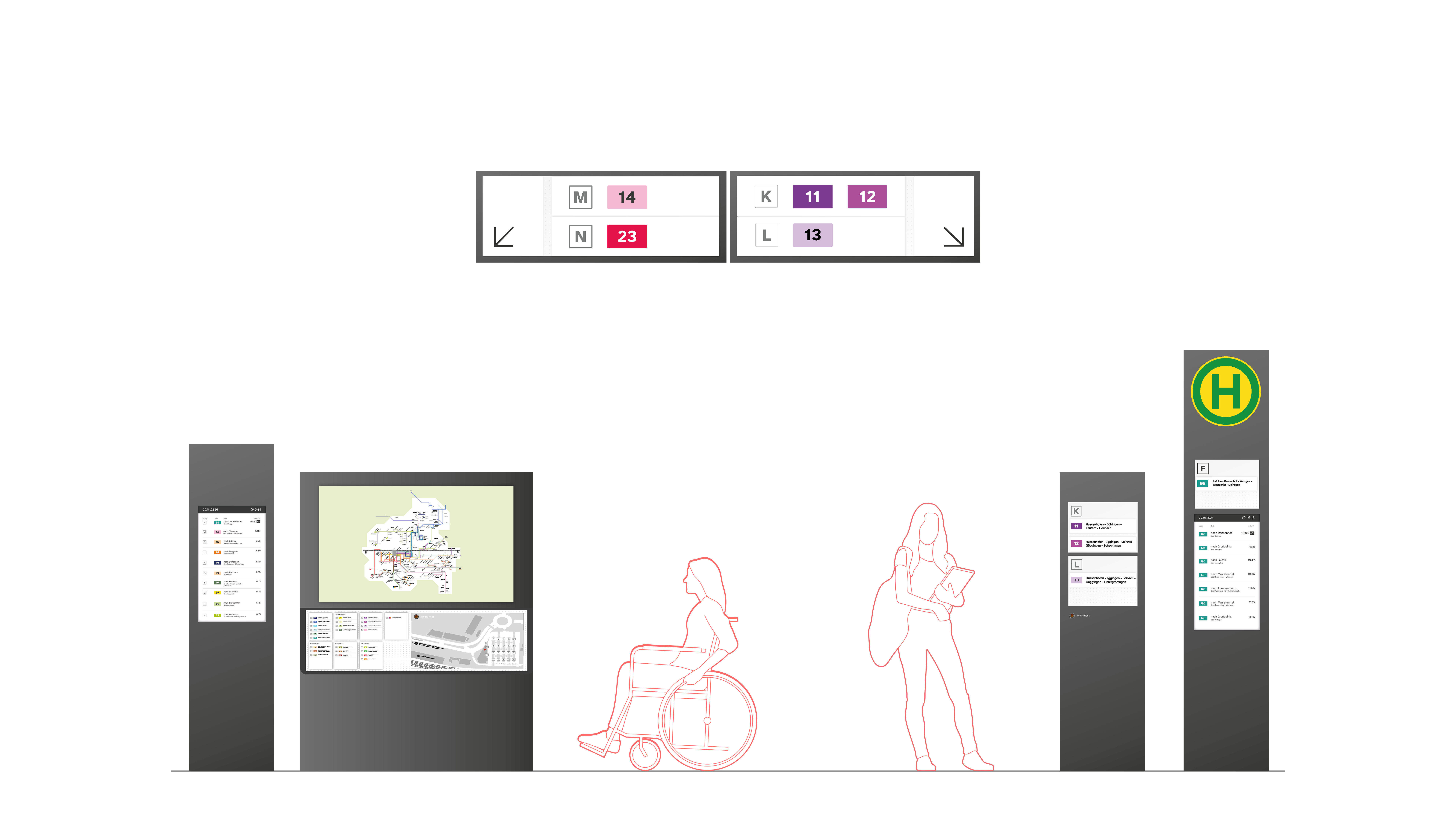
Our next step was to find suitable locations for the signs, both on the floor and on the ceiling. We decided to keep the central sign and divide the center aisle between the two stops. At the beginning and end of each bus platform, there is a sign at the front that shows which platform you are on and which one you can move on to. In addition to these ceiling signs, there are line signs next to the benches at each stop, which also include the universal timetables. The viewing heights of the individual modules were adapted to individual groups of people and designed to be inclusive.
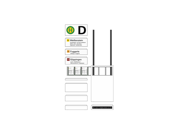
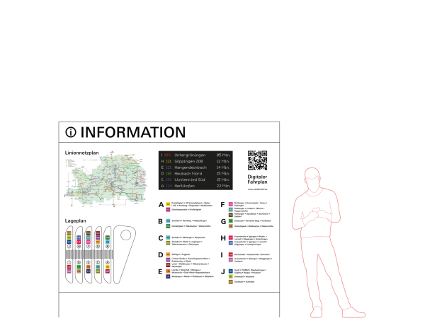
For an additional overview of the entire bus station, there is an information point at central locations that displays the most important information via both digital real-time displays and analog maps. The defined color system is also reflected in a modular system inside the buses. Here, the colored route boards are slid onto the inside of a bus partition and can be replaced as needed, but the color and route number are still easily recognizable from a distance inside the bus itself.
2. Components, Font, Color, Pictogramms
As part of the redesign of the Gmünd bus terminal, our aim was to fundamentally reorganize and clarify the existing wayfinding system, which had previously been confusing and difficult to understand. This involved a comprehensive restructuring of the bus routes and platforms. Based on this, we developed a new, coherent signage concept and implemented it accordingly. A key focus of our concept was both accessibility and modularity.
Our focus in this project was on developing an inclusive and accessible color concept. Each line departing from the bus station in Schwäbisch Gmünd is assigned its own color. These colors are based on a color palette that can be seen by 90% of all people worldwide, even those with color vision limitations. The aim of the whole thing is to ensure that a comprehensible color selection, combined with reduced typographic support, is sufficient to find the line you want to take. According to the contrast standard (AA), the rectangles are supplemented by a designation. This is either in white or black numbers.
Univers Next Pro is used for all applications on signs and other communication media in the analog space. We limit ourselves to the Medium font style. In order to create a clear hierarchy in our applications, we use distinctly different sizes. The Medium font style is used throughout, as very small or very large application sizes could cause punches to run together during printing, thus impairing legibility. For the digital displays (info points and floor signs), a dot matrix font used on the light rail system is optimized for this purpose.
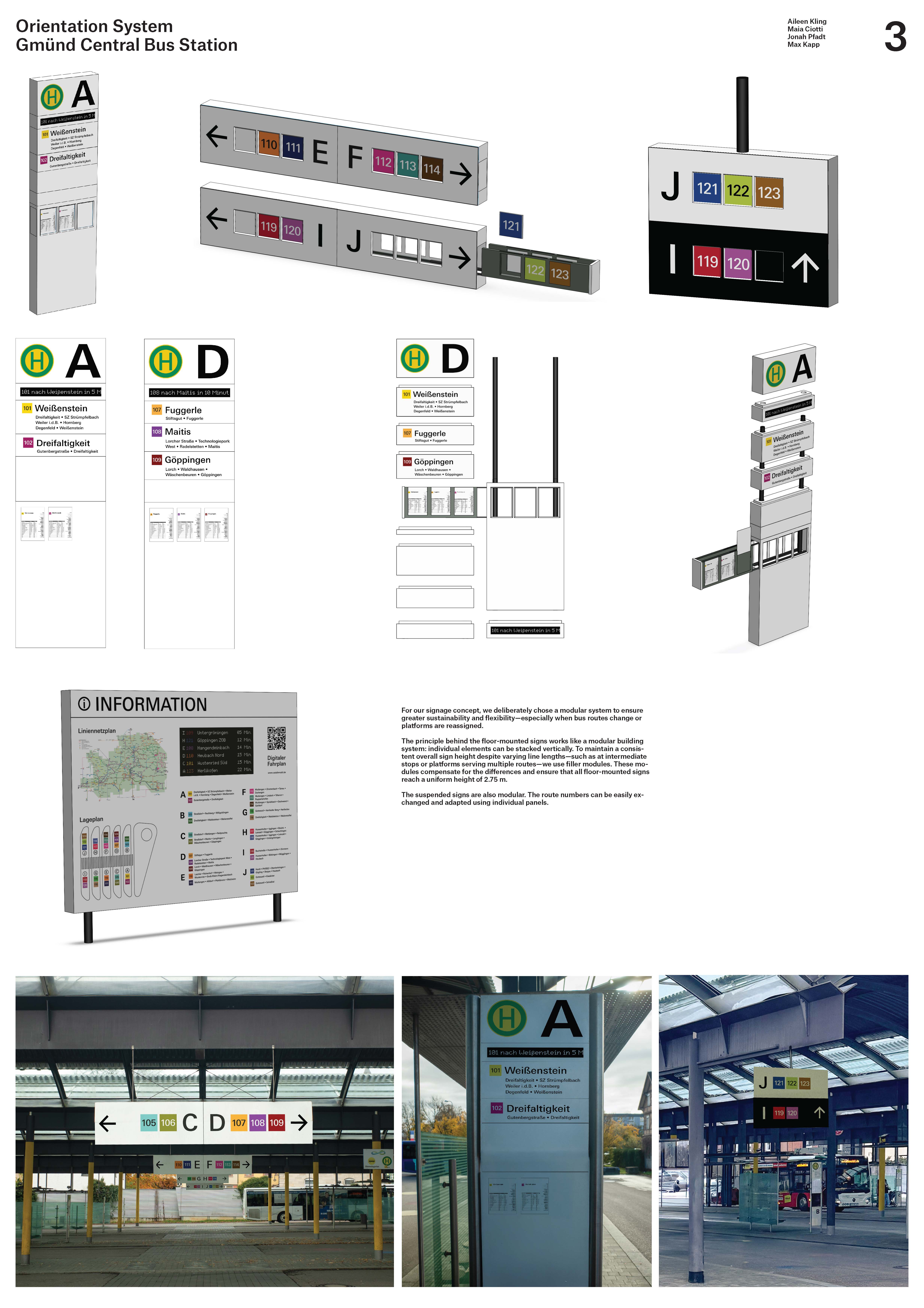
3. Renderings, Photomontages, Material in Context
For our signage concept, we deliberately chose a modular system to ensure greater sustainability and flexibility, especially when bus routes change or platforms are reassigned.
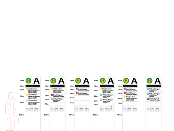
The principle behind the floor-mounted signs works like a modular building system: individual elements can be stacked vertically. To maintain a consistent overall sign height despite varying line lengths, such as at intermediate stops or platforms serving multiple routes, we use filler modules. These modules compensate for the differences and ensure that all floor-mounted signs reach a uniform height of 2.75 m.
The suspended signs are also modular. Both lettering and route numbers can be easily exchanged and adapted using individual panels.
Jonah Pfadt, Aileen Kling, Max Kapp, Maia Ciotti
BetreuungProf. Juergen Hoffmann, Lena Heim, Prof. Marc Guntow
Tags