Identity Systems
Breakthrough Initiatives
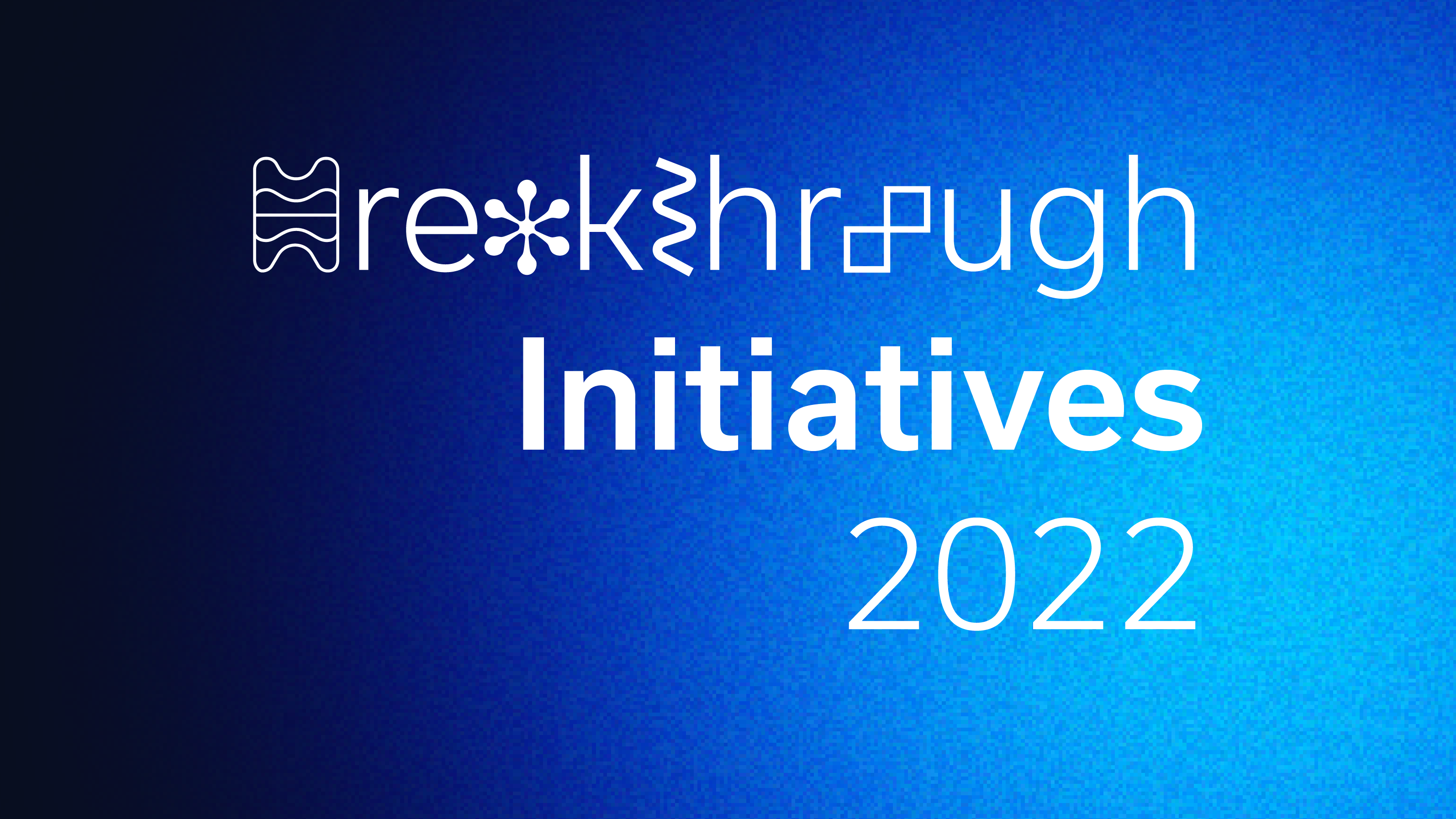
BREAKTHROUGH INITIATIVES
Life in the Universe does not only mean extraterrestrials. It also means us. No other beings have yet visited us – but neither have we stepped out to the galactic stage. Are we destined to belong to Earth for as long as we survive? Or can we reach the stars?
The Breakthrough Initiatives aims to explore the Universe and seek scientific life beyond Earth.
WEBSITE
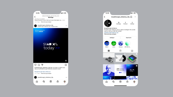
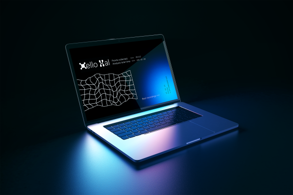
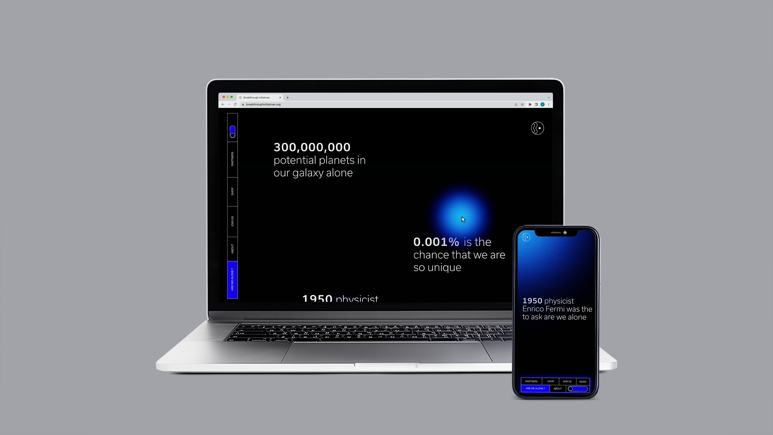
The website is the entry point to our Identity System. It has the function of gathering the most amount of people possible into the project. Its design is liquid and it translates on mobile, tablet and laptop view. The website is divided in three sections, each one dedicated to specific user groups. Thanks to animations of the fading dots following the user’s cursor and the morphing Shape Alphabet, the website becomes dynamic and not boring, thus bringing an interaction dimension to the artifact.
LOGO
The logo has a minimal and abstract aesthetic. The drawn waves both represent the B of Breakthrough and the radio waves which the Breakthrough scientists analyze in order to find a whit of life out in the universe.
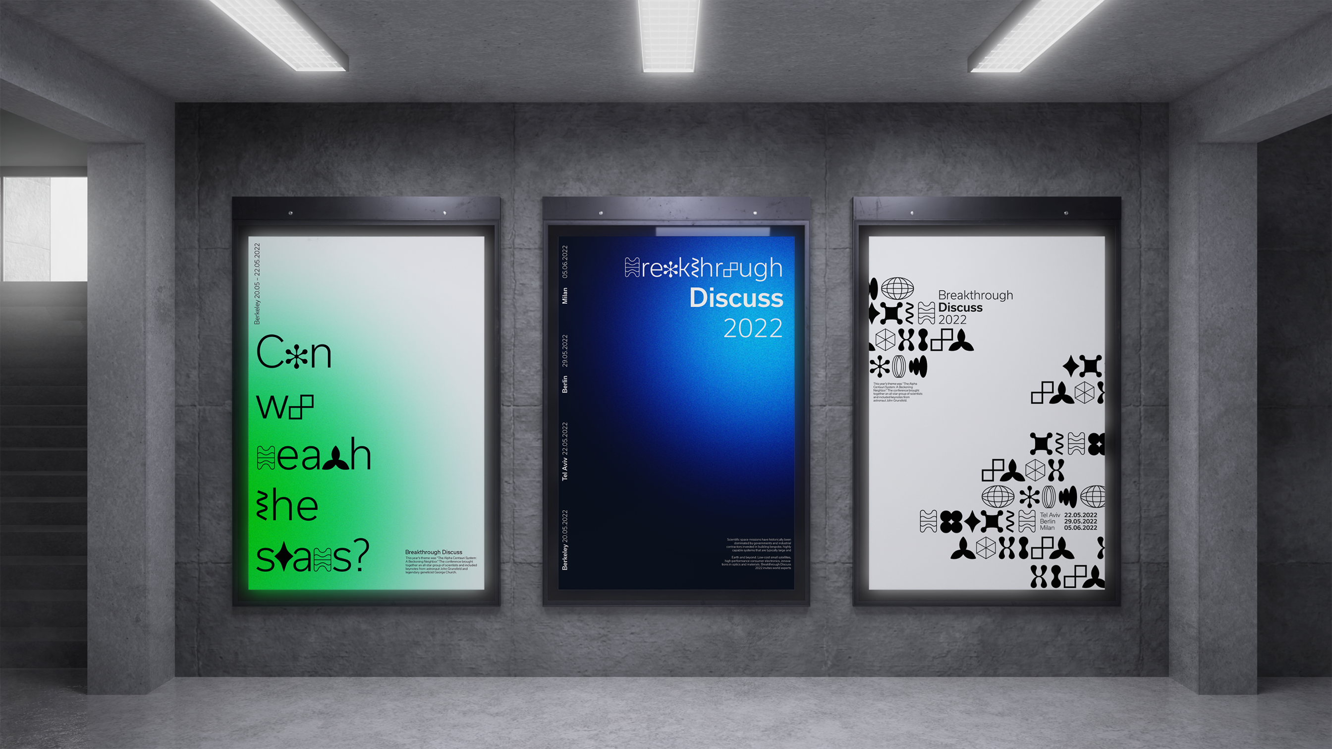
SHAPE ALPHABET
The Shape Alphabet is a modular sign system which works in combination with regular type, which is Usual Light by Rui Abreu. It is both used in static and dynamic environments. The Shape Alphabet is helping create a strong sign identity. The alphabet also works well to create patterns, which are present on any kinds of media which we show.
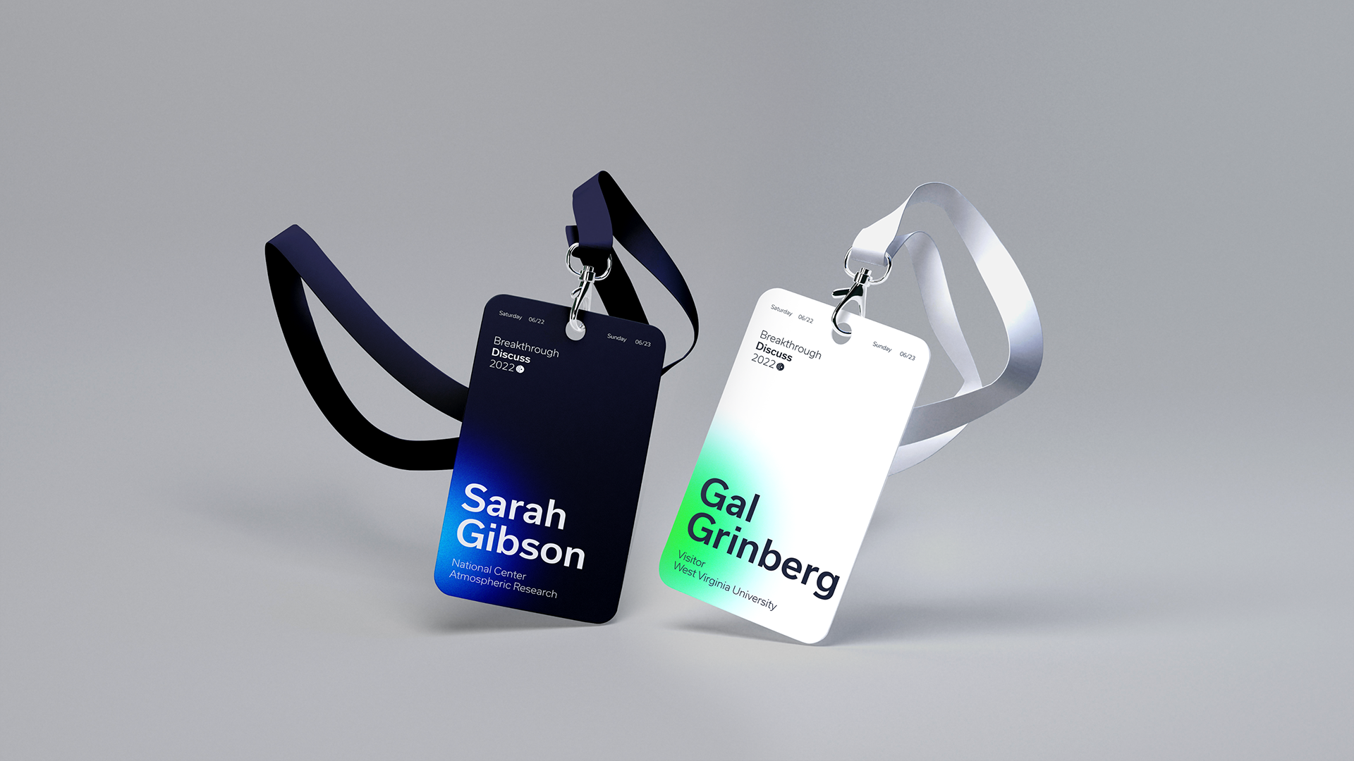
COLOR SYSTEM
The color system is based on pure RGB hues. Pure RGB green and blue are displayed in two different versions, depending on the background being white or black. Fading dots are the founding chromatical elements of our identity system, and they help reveal the unknown by “uncovering” darkness with coloured beams of light.
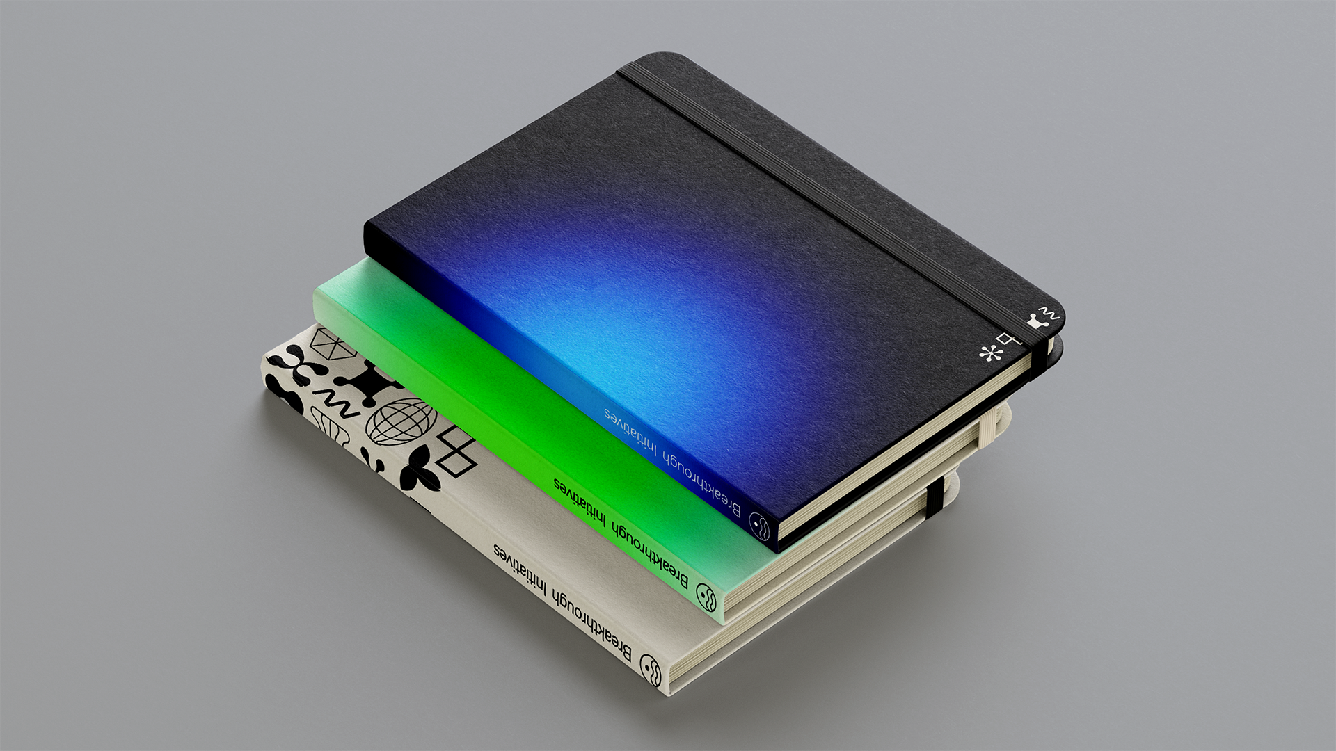
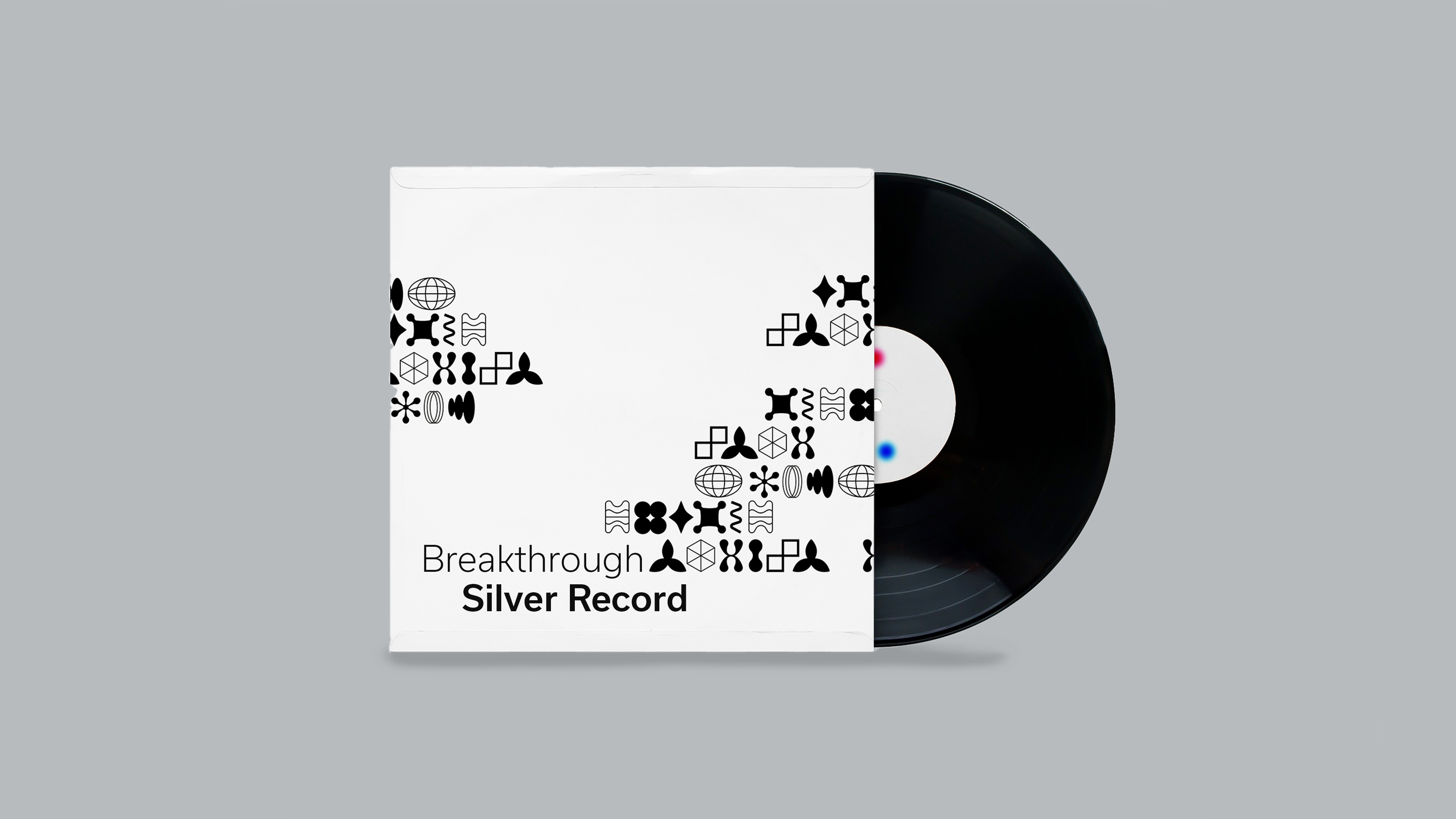
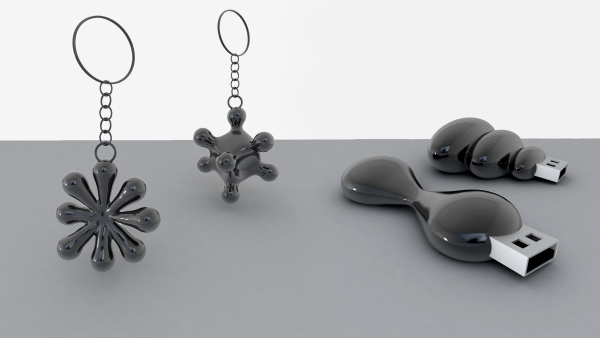
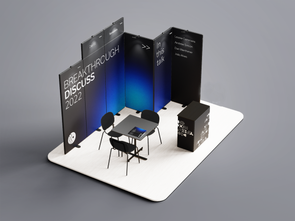
MERCHANDISE
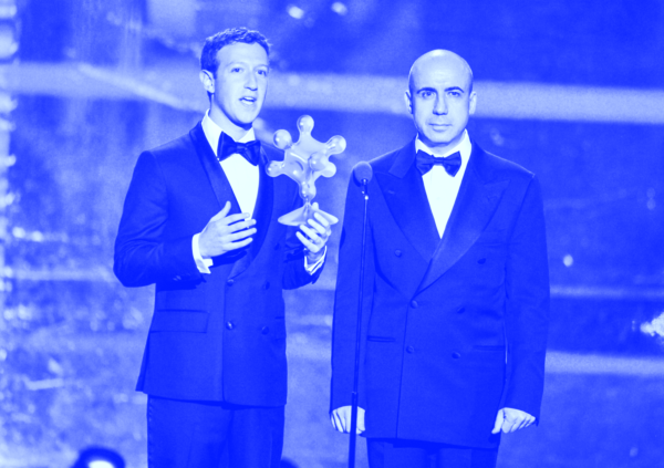
The merchandise will be available at the Breakthrough Discuss meetings and on the website. Aside from printing the Shape Alphabet on various physical media, we designed 3d printable objects, which resemble the 2d shapes in the third dimension. The trophies will be produced in a limited edition, and given to the winners of the Breakthrough Prize during the ceremony. To broaden the haptic spectrum of the project, the Silver Record contains sound messages which are produced in order to be understood by alien life out in space.