Web Design
Griffelkunst - Redesign
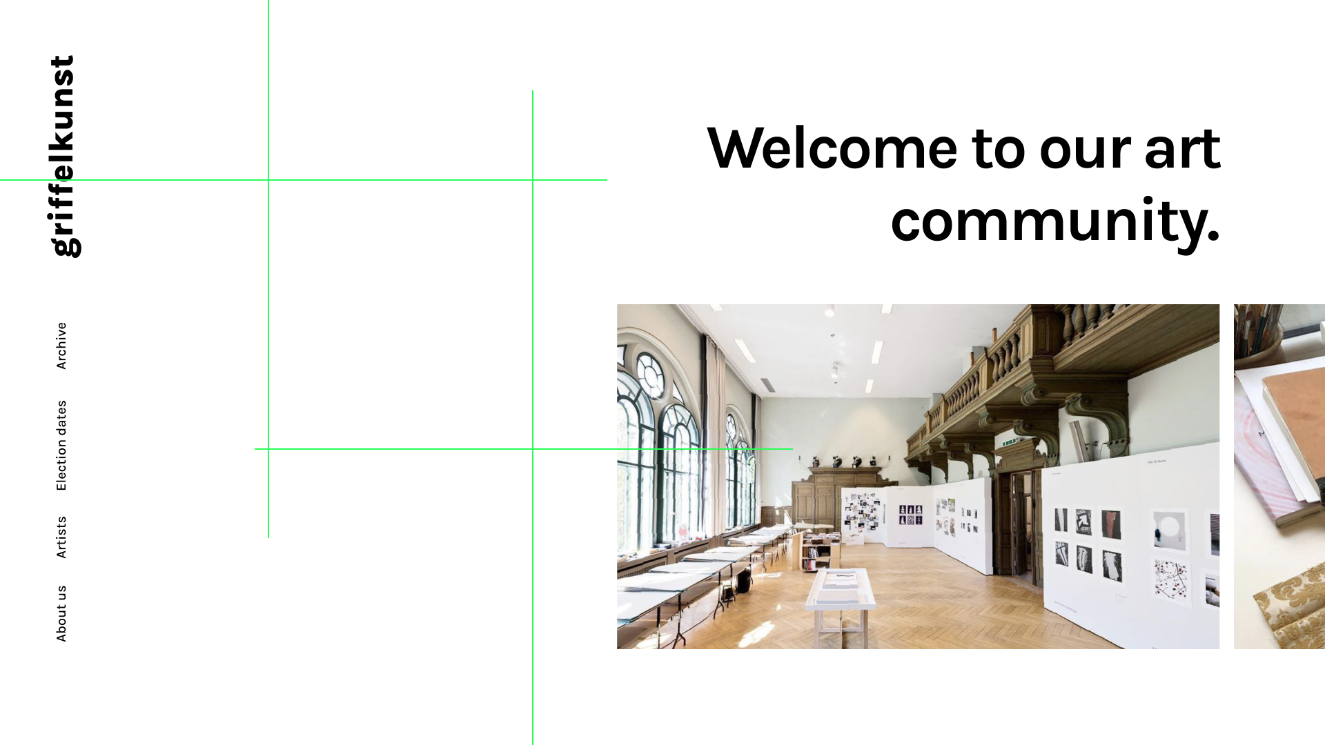
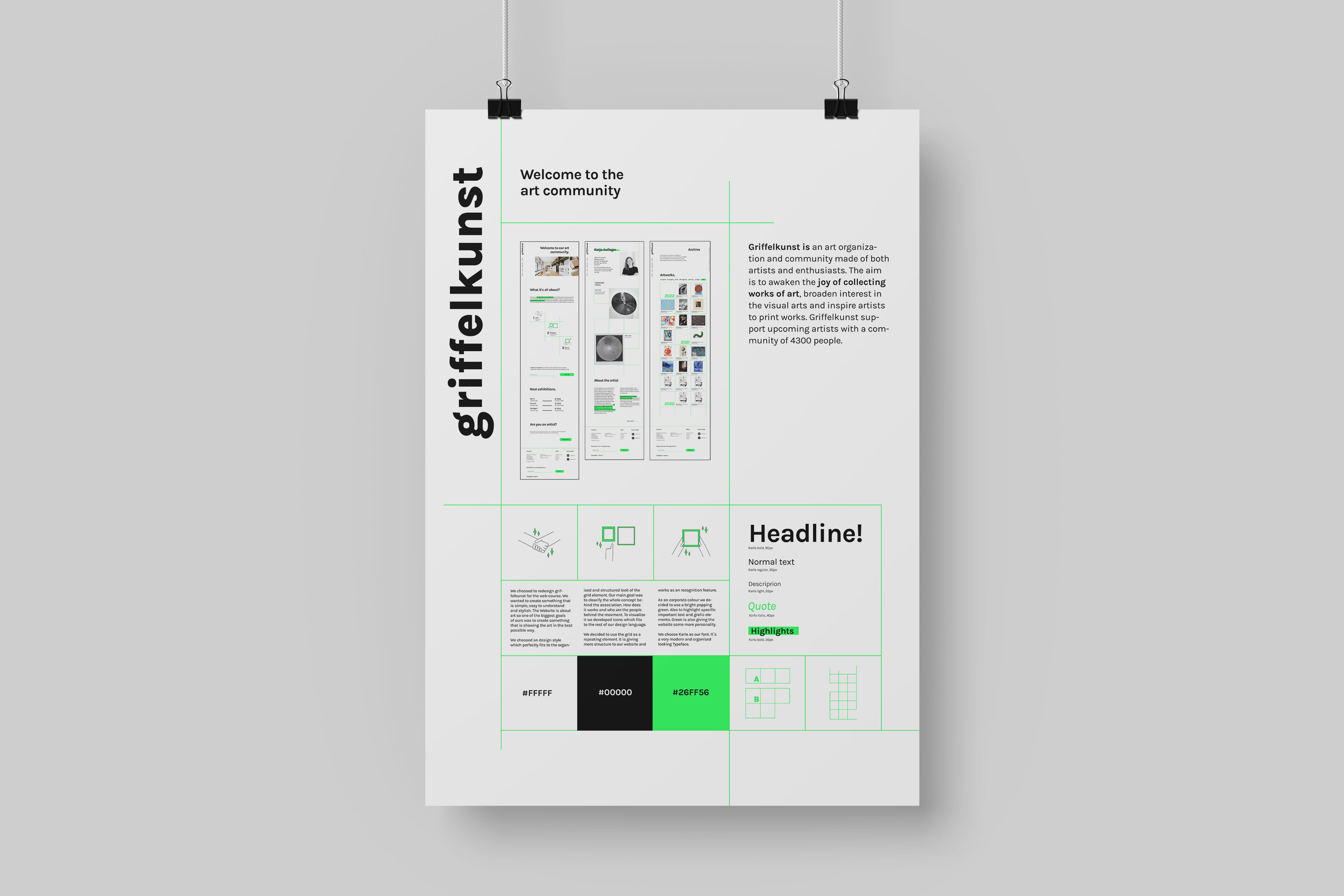
Griffelkunst
Griffelkunst is an art organization and community. Its concept is that you pay for membership every year and then you can choose 2 art pieces every half a year. You choose the artworks from exhibitions (or catalogues from them).
It’s purpose is to awaken the joy of collecting works of art, broaden interest in the visual arts and inspire artists to print works. Current Website » griffelkunst.de

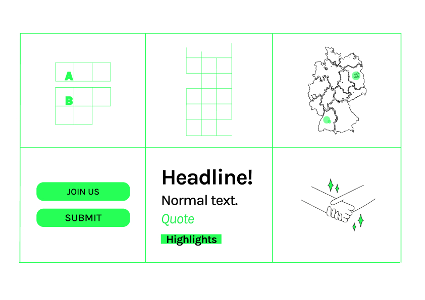
Designsystem
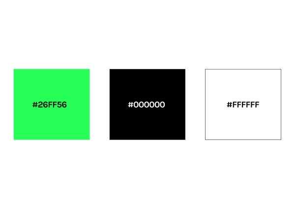
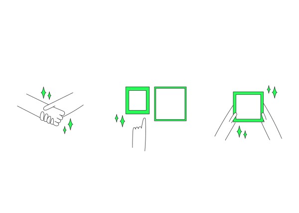
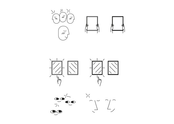
One of the main goals of ours was to make griffelkunst website more understandable. We wanted to viewer understand right away what is the page about. And because of that we wanted to create some icons to the website. We used icons with text for making the aim more clear. These icons we created for the homepage to show how griffelkunst works. We chose to use simple yet funky style with icons to create a nice, approachable look for the website. Green color was also used here - as lot of times in the website!
Poster
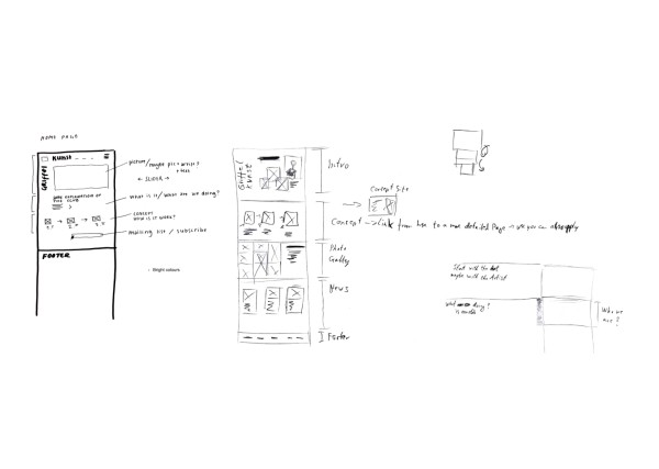
For the poster we collected all the most important design elements from our work. We included layout, icons, typography, colors and grids. We also writed something about our designing process to explain it a little bit more to a viewer. We used the grid for creating the poster too, because we wanted to maintain the theme of our work and kept it continous.
Final Website
Moritz Strobel, Pinja Kangas, Aurora Chiaravalloti
BetreuungProf. Daniel Utz, Marten Brosch
Tags