Information Design
Why climate damage pays off.
That can’t be, can it?
Climate-damaging subsidies make it possible.
You profit from them. We’ll explain how they work, why it pays off more and more to harm the climate, and what should pay off instead.
With our infographic, data visualization and explainer video.
Infographic
The first challenge was to graphically represent financial flows. We depicted the three actors - government, companies and private households - each with a circular area that reflects the abstracted quantity of finances.
If finances flow from one actor to another, it loses part of its quantity, which then moves in a line to the other actor.
This graphical system then also makes it easy to show temporal change in financial flow and quantity by making the circular areas larger and smaller.
The system further makes it easy to quickly access and understand other possibilities of financial flows.
Data visualization
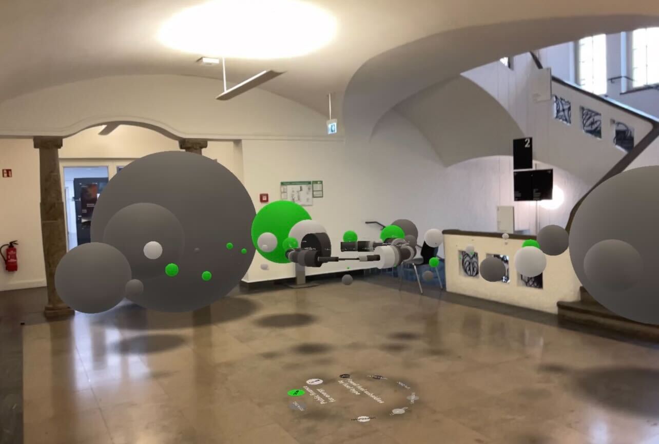
The data of the Climate Transparency initiative is very well structured and extensive. Unfortunately, the previous data visualization is very static and unclear, which is why we used the means of augmented reality to make the data experienceable in three-dimensional space.
One enters the circle of G20 countries and gets a direct overview of the volume and structuring of climate-damaging subsidies in the respective member states.
On top of this, the investments in renewable, fossil and other energies can be found as spheres.
The three-dimensionality and walkability of the data makes the amount of climate-damaging subsidies and discrepancy of climate-damaging and climate-friendly investments impressive to the person viewing the data.
Video
The foundation of the explainer video is the excerpt from the webinar presenting the 2022 Climate Transparency Report, in which the speaker presents the data on climate-damaging subsidies.
To this section, we added our graphic work and data visualization explanatory to make the topic more understandable and memorable.